


A press release photo is not there to look nice. It is there to survive a newsroom scan, make an editor pause, and still look sharp after syndication, cropping, and compression. The releases that get used usually put the visual near the opening, keep it relevant to the announcement, and give editors a file they can publish without extra work. Industry guidance commonly recommends 1 to 3 high-quality photos per release, with the strongest image placed in the top third or immediately after the first paragraph, and with captions plus IPTC metadata already filled in (Silverback Press Release guidance on photo placement and count).

Table of Contents
- What a Press Release Photo Has to Do to Earn Its Place
- Shots, Styles, and Subjects That Survive Newsroom Cropping
- Technical Specs That Pass Every Newsroom Test
- Preparing and Delivering Files Without Breaking the Workflow
- Captions, Credits, and the Metadata That Gets You Found
- Model Releases, AI Disclosure, and the Legal Basics
- Your Pre-Send Checklist and a Faster Way to Source the Portrait
What a Press Release Photo Has to Do to Earn Its Place
A usable press release photo earns attention by giving an editor a reason to keep reading. Most images get skipped because they look like decoration instead of evidence. The release lands, the headline gets scanned, the first visual gets a glance, and if the asset does not help tell the story, it gets ignored.

Editors want an image that matches the announcement, looks original, and does not create extra work in their CMS. In practice, that means the photo has to be easy to place, easy to crop, and easy to understand without a long caption. A newsroom image only helps if it is ready for quick reuse and sits near the opening of the release, which is the part readers and editors are most likely to see first (Silverback Press Release).
Practical rule: if the image cannot explain the announcement at a glance, it is not pulling its weight.
That is why press release photos need editorial usefulness, not marketing polish. A founder portrait works if the story is about leadership, funding, hiring, or a launch tied to a person. A product image works if the product is the subject. A location or team image works if it gives context the copy cannot carry alone. The wrong photo is often the prettiest one, because it is usually the least informative.
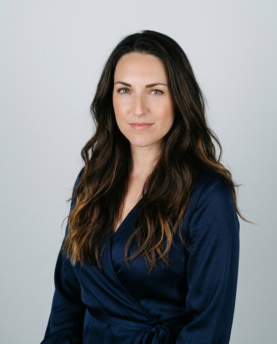
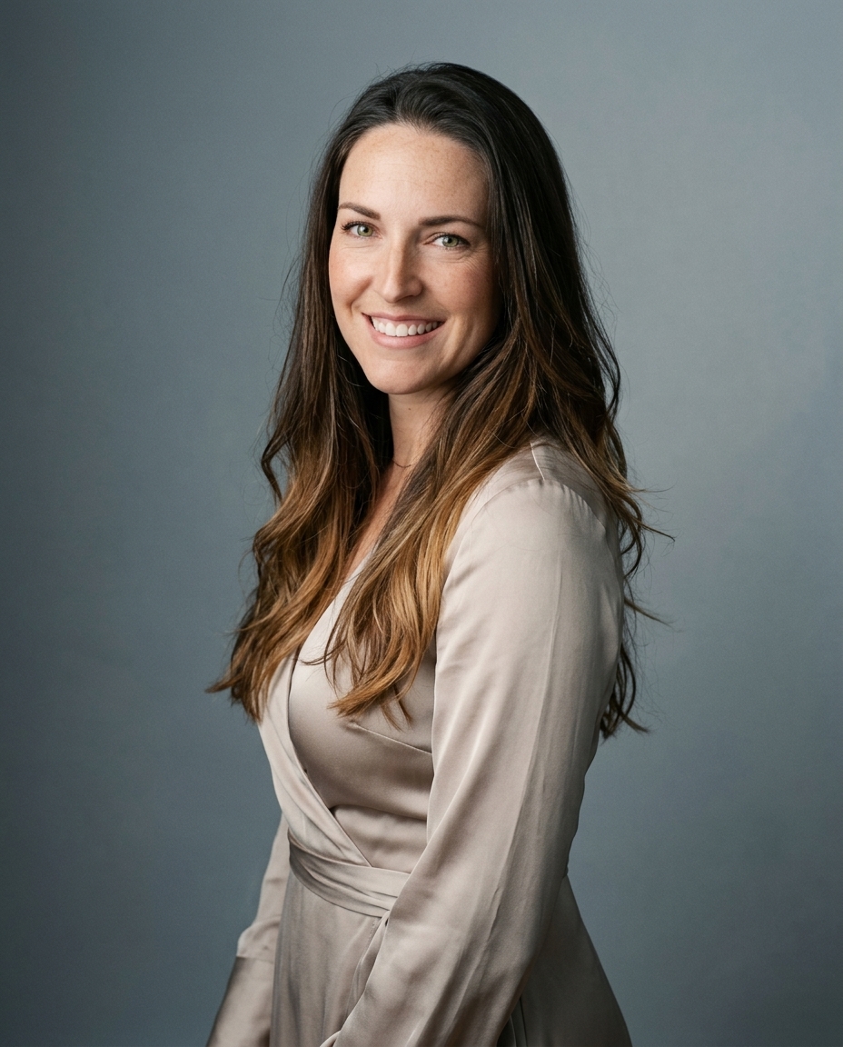
A photographer-built system like AiHeadshots is aimed at fast executive portraits for press kits and bios, while traditional shoots still make sense when a release needs a specific scene or product setup. For teams choosing AI-generated headshots, the background still matters, so a guide like how to choose the right headshot background helps keep the portrait usable in different layouts. The point is not to flood the release with pictures. The point is to give the editor one image they can trust.
Shots, Styles, and Subjects That Survive Newsroom Cropping
Cropping is where good intentions die. Editors cut verticals into squares, strip backgrounds down to thumbnails, and reuse hero shots in layouts you never controlled. That means the safest press release photos are framed with room to spare, with the subject centered enough to survive resizing and with no clutter fighting for attention.
Keep the frame simple
A horizontal 16:9 image around 1,920×1,080 px is a strong newsroom-friendly starting point, because it holds up in previews and thumbnails (LinkedIn guide on choosing press release images). The same guide recommends 1,000 to 2,500 px wide and warns against text or pricing overlays, which usually get stripped or ignored. That aligns with what I see in practice. Clean composition gets used more often than busy composition.
The other piece is expression. In an executive portrait, a relaxed, direct gaze reads better than a stiff corporate smile. The audience has seen the old pose enough times to spot performance immediately. You want the subject to look like a real person in a real role, not a brochure model in a blazer.
Use three shot types, not twelve
The most reliable mix is narrow. One hero portrait. One wider context shot. One detail or product close-up. A multimedia guide recommends a single hero photograph as the foundation, plus two to four supporting assets, which is useful because it gives editors options without burying the story in visual noise (Instant Press on multimedia assets).
That doesn't mean you should always send all of them. It means you should select with restraint. Overfilling a release makes it feel like a gallery, not a press packet.
Editors don't reward abundance. They reward clarity.
For portrait work, background choice matters more than people expect. A distracting wall, a logo wall with too much branding, or a harsh stock-like gradient looks dated fast. We keep our headshot setups simple for the same reason. A press photo has to hold up after the newsroom crops it, not just on the day it was shot. If you want a deeper background discussion, this background guide for headshots is the right companion piece.
Technical Specs That Pass Every Newsroom Test
Specs are where DIY releases usually break. The photo looks fine on your screen, then arrives soft, bloated, or oddly compressed after a platform handles it. The safe baseline is still straightforward. Use JPEG or PNG, keep the file around 2 to 5 MB, and hold the image to at least 1,200×800 px for web use so it stays sharp after syndication and resizing (eReleases image guide).
For print-ready use, 300 DPI still matters. That setting belongs on the master file, not on a screenshot or a resized image that has already been pushed through social compression. Digital distribution is commonly handled at about 72 DPI, which works for screens as long as the pixel dimensions are high enough. For portrait files with tighter approval standards, the practical file checklist in this headshot requirements guide is a useful reference point before you send anything out.
Keep the file newsroom-friendly
Editors prefer lighter assets for a reason. Huge files trigger email limits, slow down previews, and get stripped by some distribution systems. A clean link or a simple gallery gives a newsroom a faster path than a giant attachment, and that matters more than trying to force every version into one upload.
A practical way to handle the technical side is this:
- Print target: 300 DPI and a clean high-resolution master.
- Digital target: about 72 DPI, but with enough pixel width to stay sharp.
- File format: JPEG or PNG.
- Delivery size: keep it in the 2 to 5 MB range when possible.
- Placement: make sure the image still reads as a thumbnail.
The source on press release layout also notes that images are often placed between the headline and the opening so they stay visible without pushing the copy too far down the page (PR News on press release images). That layout detail matters because a technically correct image still fails if the platform buries it.
For portrait work, I keep the rule simple. Export for reuse, not for your monitor.
Preparing and Delivering Files Without Breaking the Workflow
A strong photo can still fail in delivery. If the file name is unreadable, the metadata is thin, or the asset lands in an email thread that gets filtered out before an editor opens it, the picture never gets a fair look. The workflow has to be as clean as the image.
Export settings are where that work should happen. Lightroom and Photoshop let you handle filename, metadata, color handling, and caption text before the file leaves your desk. Use descriptive file names that identify the subject and the release, not camera junk like IMG_4829.jpg. Journalists should be able to tell what the asset is at a glance, and the same logic applies whether the file started as a studio portrait or a set of AI-assisted selfies prepared through the selfie upload instructions.
Delivery path matters just as much. Email attachments work for tiny internal sends, but they are the weakest option for press distribution. Newsroom upload links and embedded media galleries are better because they avoid attachment limits and keep the asset closer to the story. That pattern shows up in the workflow guidance in the brief, modern PR favors links, captions, credits, and tracked distribution over bulky attachments (Prowly on press-release pictures).
Match the channel to the asset count
If you have one headshot, a direct link is usually enough. If you have a few supporting images, an inline gallery gives editors room to choose without downloading a zip file. If you are distributing a media kit, keep the package organized so each file is obvious, labeled, and easy to reuse.
Working rule: the fewer clicks an editor needs, the more likely the image gets used.
That also changes how I build the export. I keep a clean master, then make the smallest delivery version that still looks sharp in a newsroom preview and survives reuse across web and social placements. If the file is too large, it slows down the send. If it is too compressed, editors notice it immediately. For portrait work, a fast studio-style option can cut the production delay, but the file still needs to be prepared like any other release asset. One option is AiHeadshots, which fits quick headshot sourcing when the release needs a clean portrait without a full shoot day.
If you are moving photos through a press pipeline, keep the export routine boring. Boring files get published.
Captions, Credits, and the Metadata That Gets You Found
A photo without a caption asks an editor to do homework, and most editors will skip it. That is why captions are part of the asset, not an extra. The best press release photos arrive with the identifying text already attached, so the image can be used without a follow-up email.
The caption should be 1 to 2 sentences and answer the newsroom basics, who, what, when, where, and why. The credit line should be clear and consistent. If a journalist reuses the asset, they need to know who made it and how to attribute it correctly.
The metadata fields that matter are straightforward. Title, description, keywords, copyright, creator, and usage rights. These fields help syndication systems and editors identify the asset quickly, and they separate a searchable file from a mystery image sitting in a folder. Silverback Press Release guidance makes the same practical point about keeping the photo package easy to identify and use.

For accessibility, alt text should describe what is in the image, not stack keywords. “Founder speaking at product launch with team behind her” works. “Press release photos, executive, business, startup, AI” does not. Clarity matters more than keyword stuffing.
A clean caption template looks like this:
Who: full name and role.
What: what is happening in the image.
Where: location if it matters.
When: date or event timing if needed.
Credit: photographer or rights holder.
That structure gives editors everything they need in one pass. It also keeps the asset usable across website posts, media kits, and syndication feeds without back-and-forth email. For broader cleanup and takedown questions around copyrighted images, a useful reference is expert advice from ContentRemoval.com.
Model Releases, AI Disclosure, and the Legal Basics
A press release photo can look polished and still be unusable if the rights are unclear. The legal basics are straightforward. You need model releases for identifiable people, property releases for recognizable private locations, and rights confirmation for any third-party content visible in frame.
AI-generated portraits add another layer. If the image is AI-assisted, the journalist needs that disclosed plainly, and your company needs to know exactly what rights it holds. Newsroom standards are still settling around synthetic imagery, especially when the portrait is meant to represent a real person or executive identity.
There is also a practical rights issue that teams often miss. If a company depends on scraped-source tooling, it can create avoidable uncertainty around provenance. A photographer-built system is a different category. AiHeadshots was built by photographers at Studio Pod after years of professional shoots, which gives it a cleaner foundation for studio-style portrait work than open-model tools repurposed from generic training data. That background matters when the output is meant to sit beside real editorial assets.
For broader cleanup and takedown questions around copyrighted images, a useful reference is expert advice from ContentRemoval.com. It is especially relevant when teams are auditing old press kits or inherited media folders.
Keep disclosure language direct. If a portrait is AI-generated, say so in plain terms where the release or media kit makes that clear. Do not bury it. Do not dress it up. Newsrooms value honesty, especially when the image represents a named person.
Your Pre-Send Checklist and a Faster Way to Source the Portrait
The last pass should be short enough to run every time. Check the image count. Check the crop. Check the file spec. Check the metadata. Check the caption. Check the credit line. Check the release or permission note. If one item is missing, the press kit is not ready.

If the release depends on a polished founder or spokesperson portrait, speed becomes a primary constraint. A traditional photographer can run $300 to $600+ for a day rate, and the turnaround can stretch to one to three weeks. AiHeadshots gives you 30+ studio-grade headshots in about 30 minutes from 10 to 20 phone selfies, with pricing at $29 for Basic, $39 for Professional, $59 for Executive, and Teams starting at $22 to $29 per seat at 10+ seats. It also carries a 14-day money-back guarantee. Public-facing materials from the service say it has served 30,000+ customers, delivered 255,000+ headshots, and holds a 4.9★ rating.
Use the faster path when the portrait is the bottleneck. Use a full shoot when the story needs a specific setting, wardrobe, or moment.
For a clean headshot in a release workflow, upload the selfies and check how the file holds up beside the other assets. AiHeadshots is built by photographers, which matters when the output has to read like a real studio portrait, not a generic profile crop.
Keep the final send practical. If the image is AI-generated, disclose that plainly. If the portrait is for a named executive or spokesperson, make sure the file, caption, and rights line all match before the email goes out.