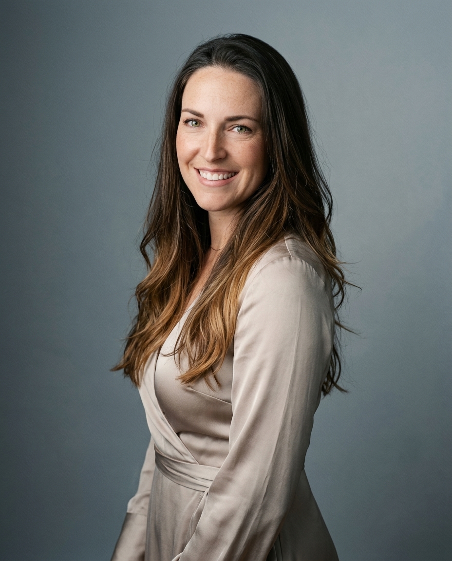

The right background makes the headshot. It isn't decoration. It's a signal that people read before they scan your job title, company, or bio. LinkedIn says profiles with professional photos get up to 21 times more profile views and 36 times more messages on the platform, which is why the background decision matters at all in the first place, not as style but as credibility framing. We learned that the hard way and then the useful way, by photographing 10,000+ real professionals at Studio Pod in Houston since 2019.
That volume changes your eye. You stop chasing trends and start seeing patterns. Some backgrounds disappear and let the face do the work. Others create friction, flatten skin tone, or date the image fast. As photographers, Joseph West and Chris Bailey built AiHeadshots from those patterns, not from generic open models retrofitted for business portraits.
If you're also weighing a physical studio session, the Encore Film And Music Studio guide is a useful companion for understanding the studio side of the decision. Here are the eight best headshot background styles, what each one says, and where each one wins.
Table of Contents
- 1. Neutral gray backdrop
- 2. Soft blur (bokeh) background
- 3. White or off-white background
- 4. Textured or patterned background
- 5. Color gradient background
- 6. Environmental or context background
- 7. Dark or black background
- 8. Brand or company-colored background
- 8 Headshot Backgrounds Compared
- A background is a choice, not a default
1. Neutral gray backdrop

Gray is the default for a reason. Light gray is recommended for roughly 80% of professional contexts because it stays neutral across industries, skin tones, outfits, and platforms, according to Scale Headshots on best headshot backgrounds. That's the closest thing this category has to a universal answer.
We see the same thing in studio work. Gray doesn't pull attention. It doesn't fight navy, black, jewel tones, or white shirts. It also holds up at thumbnail size, which matters more than commonly realized because that's where LinkedIn, directory pages, and email signatures live.
Why gray keeps winning
Gray works for attorneys, consultants, physicians, executives, recruiters, government staff, and almost anyone who needs broad corporate credibility. It's especially strong when your headshot has to travel across multiple uses. LinkedIn today. A conference badge next month. A company bio page after that.
Practical rule: If your job depends on being trusted before you're known, neutral gray is the safest background you can choose.
There is one common mistake. People wear medium gray against medium gray and erase the separation. Wear darker or more saturated clothing instead. Jewel tones, deep green, navy, burgundy, and a clean white shirt all sit well against a soft gray background.
If you're fixing a casual photo instead of shooting from scratch, a headshot background remover tool is useful for testing whether gray immediately improves focus on your face. In our workflow, AiHeadshots renders gray with enough subtle texture to keep it from looking flat, but never enough to read as a wall or set.
2. Soft blur (bokeh) background

Blur is where a lot of bad advice starts. People hear "blurred background" and assume more blur means more professional. It doesn't. In headshots, too much blur looks synthetic and removes the environmental cues people use to judge credibility.
Adobe's background guidance is useful here because it speaks directly to how photographers control separation and focus in portrait work. The overlooked sweet spot is the Adobe discussion of headshot backgrounds and lens blur, especially for professionals who want depth without losing realism.
The blur threshold that actually works
The trustworthy range is a soft blur that still leaves a hint of context. The source material above identifies f/2 to f/4 as the useful zone, while overly aggressive blur beyond f/1.2 can reduce authenticity and trustworthiness, and overly sharp backgrounds at f/8+ start competing with the face. That's exactly what we see in practice. Good bokeh isolates the subject. Bad bokeh looks like a filter.
A blurred background should read as context, not as a special effect.
This style works well for performers, media professionals, startup leaders, coaches, consultants, and sales roles where warmth matters. It also works for people who hate the sterile look of a uniform backdrop but still need something controlled. AiHeadshots handles this best when the original selfies are clean and well lit, because realistic blur starts with realistic edge detail around the face and hair.
If you're shooting on a phone first, using iPhone Portrait mode for catalogs is a practical way to understand how shallow depth of field changes the feel of a portrait before you commit to a final style.
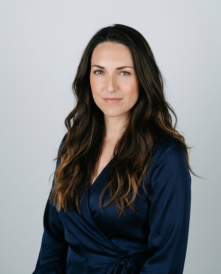
3. White or off-white background
White is clean. Off-white is often smarter. The difference matters because pure white can erase edge definition and wash out lighter clothing, while a warmer off-white preserves the same minimal look with better separation.
This background is strongest where clarity and consistency matter more than personality. Think employee directories, academic faculty pages, ID systems, healthcare listings, and actor submissions that need an uncluttered frame. In those uses, the point isn't atmosphere. The point is immediate readability.
Where white is the right tool
Healthcare is the clearest example. Industry benchmarks show healthcare professionals often use white for identity verification contexts, while gray stays the broader default and muted blue serves finance and law. White signals clean, clinical, and straightforward.
The trade-off is visual collapse. A white background against a white webpage can make the portrait feel like it disappears into the interface. That's why off-white often performs better on modern screens. It keeps the clean look without losing the edges of hair, shoulders, and clothing.
For darker skin tones, white can look excellent if the face is lit warmly and evenly. For cream jackets, beige tops, and pale blond hair, it needs more care. We compensate for that in AiHeadshots with lighting and skin tone balancing because a white background that isn't balanced looks cheap fast.
Use white when the image needs to feel standardized, not stylized.
4. Textured or patterned background
Texture gives you realism without forcing a full environmental scene. That's why it works so well for agencies, designers, architects, startup leadership, and modern consulting brands. A little texture can make a headshot feel less sterile and more editorial.
The key word is little. Fine brick. Painted plaster. Soft wood grain. A muted panel pattern. That's enough. Anything louder starts competing with the eyes, jawline, and expression, which means the background is doing too much.
Texture without distraction
We use textured backgrounds when a plain gray feels too corporate but a real office feels too busy. This middle lane is useful because it creates depth while staying abstract. It suggests a place without asking the viewer to inspect the place.
A textured background also ages better than trendy office decor. Exposed neon signs, hyper-modern coworking spaces, and overly designed sets can lock a portrait to a specific visual moment. Subtle texture stays current longer because it isn't trying to prove anything.
If you want to see where this look lands well, the AiHeadshots examples gallery shows how texture changes the feel of a portrait without changing the person. That's where our photography heritage matters. We built AiHeadshots after years of seeing which backdrops add depth and which ones steal it.
For clothing, keep it simple. Structured jackets, monochrome layers, and clean collars pair well here. Wild prints don't.
5. Color gradient background
Gradients can look expensive. They can also look fake fast. The difference is restraint.
A good gradient feels like light shaping a backdrop in camera. It doesn't feel like a graphic design layer dropped behind a cutout. That's why the best versions are subtle. A neutral-to-charcoal fade. A muted blue-gray shift. A warm beige into soft shadow.
Where gradients look expensive and where they don't
This style shines for founders, tech executives, SaaS team pages, media personalities, and consulting brands that want something more polished than flat gray. It gives depth and a premium feel without asking the viewer to process an actual setting. That's useful when you want modern but not casual.
Muted blue gradients are especially relevant in sectors where trust needs to be visible. Earlier industry guidance already noted blue's role in finance and law. In gradient form, that trust signal becomes easier to control and less rigid than a flat blue backdrop.
The mistake is saturation. Strong oranges, bright cyan, and obvious two-tone effects date the image and reduce reusability. Headshots aren't campaign posters. If the gradient is the first thing someone notices, it failed.
We build these in AiHeadshots with realistic falloff because photographers don't think of a gradient as color first. We think of it as light. That's also why this style pairs well with clean tailoring, modern personal brands, and digital-first businesses that want visual consistency without looking generic.
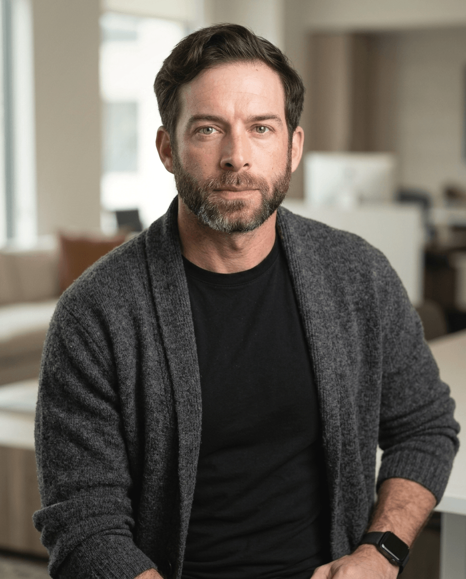
6. Environmental or context background
Some people need the setting to say part of the story. A therapist in a calm office. A real estate agent in a refined workspace. An author near bookshelves that don't scream for attention. A fitness coach in a clean studio. That's where environmental backgrounds win.
This style answers a question the viewer won't consciously say out loud. Where does this person work? If the answer supports the role, trust builds faster. If the setting is random, cluttered, or too sharp, trust drops.
Here is a useful example of environmental framing in action:
Use a place that says something true
The strongest environmental headshots feel plausible. They don't need to be literal. A consultant doesn't need a visible laptop. A speaker doesn't need a stage. But the scene should align with the work. Soft office lines, a bookshelf, architectural detail, or natural light can all do that subtly.
This is also where AI tends to fail if it wasn't built by photographers. Generic systems often overbuild the setting. Too many props. Too much detail. Too much fake realism. We built AiHeadshots from real studio sessions, so the system keeps the environment behind the subject, not beside them.
Choose an environment that supports your role in one second, then let it disappear.
Environmental backgrounds are strong for client-facing professionals and weaker for highly standardized team grids. If one lawyer has a blurred office and nine partners have neutral studio backdrops, the outlier looks accidental. Use this style when context adds something important and true.
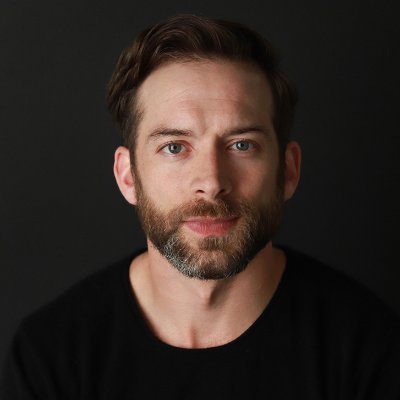
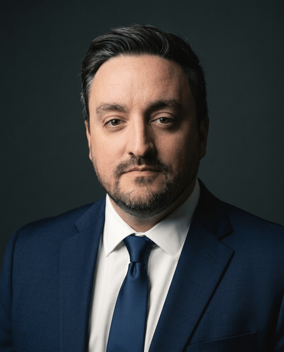
7. Dark or black background

Dark backgrounds carry authority fast. That's why executives, partners, board members, and senior academics keep coming back to them. The face comes forward. The posture matters more. The image feels formal before anyone reads the caption.
Charcoal is usually more useful than pure black. Earlier background guidance pointed to charcoal as the executive choice because it gives authority without the theatrical feel that full black can create. We agree. Black is powerful, but it can become too dramatic for general business use.
Authority has a tone
This style rewards structure. A dark suit, a white or light blue shirt, direct eye contact, and clean facial light create the classic executive portrait. If the face isn't lit well, though, a dark background just turns into swallowed detail. That's where many DIY attempts fail.
Use dark backgrounds for C-suite profiles, law firm partner bios, finance leadership pages, university administration portraits, and investor-facing materials. They also work well when your job requires visible seriousness. Not sternness. Seriousness.
One more practical point. Skin tone and wardrobe contrast matter more here than almost anywhere else. A charcoal jacket on charcoal background with low facial light is a muddy file. A light shirt against charcoal reads immediately.
8. Brand or company-colored background
Team headshots have a different job than individual headshots. They need to look like they belong together. That's where a company-colored background can make sense, especially for organizations standardizing photos across 10+ people, remote teams, and multi-office groups.
This isn't about flooding the frame with a logo color. It's about using a controlled version of the brand palette so every portrait feels connected. Usually that means a desaturated color or a toned-down gradient, not a fully saturated wall of corporate blue or green.
Consistency matters more for teams
For companies managing headshots at scale, the logistics matter as much as the look. Traditional photographer coordination still often runs in the $300 to $600+ day-rate range, while the standard individual AI headshot price point in 2026 is reported at $29 for 30+ professional headshots with a short turnaround. That price pressure is one reason brand-consistent AI headshots have become part of team operations, not just personal branding.
AiHeadshots is built for that use case because we're photographers first. Studio Pod has photographed 10,000+ real professionals since 2019, and that background matters when you're trying to make ten, fifty, or hundreds of headshots look like one system instead of a collage. Our guide to different types of headshots is a useful starting point if you're deciding between individual portraits, executive sets, and team-wide branding.
Competitors like HeadshotPro, BetterPic, Aragon, Secta, and ProPhotos also serve this category. The difference with AiHeadshots is straightforward. We came from a working portrait studio, we deliver 30+ studio-grade headshots in about 30 minutes, and plans start at $29. Teams can also use volume pricing through our team headshots workflow when consistency is the brief.
8 Headshot Backgrounds Compared
| Background | 🔄 Implementation complexity | ⚡ Resource requirements | ⭐📊 Expected outcomes | Ideal use cases | 💡 Key advantages |
|---|---|---|---|---|---|
| Neutral gray backdrop | Low, simple studio setup, minimal touchups | Minimal, basic lighting; low post‑processing | ⭐⭐⭐⭐ Consistent, professional look; high reproducibility | Executive profiles, corporate directories, regulated professions | Non‑distracting; complements all skin tones; prints cleanly |
| Soft blur (bokeh) background | Medium, requires shallow DOF simulation or lens work | Moderate, quality optics or realistic AI blur; careful rendering | ⭐⭐⭐⭐ Polished, dimensional portraits; highlights subject | Creative roles, actors, client‑facing and startup executives | Adds depth and sophistication; emphasizes eyes and expression |
| White or off‑white background | Low, straightforward but lighting‑sensitive | Low, strong, balanced lighting crucial to avoid washout | ⭐⭐⭐⭐ Bright, clear images; easy to crop and repurpose | Casting headshots, corporate, academic, ID/passport style photos | Clean, universal standard; maximizes clarity and approachability |
| Textured or patterned background | Medium, texture choice and blur balance needed | Moderate, texture assets and subtle depth rendering | ⭐⭐⭐ Distinctive and modern; moderate impact across audiences | Tech, design, marketing, creative agencies, modern startups | Adds personality without full environmental context; visual interest |
| Color gradient background | Medium, color selection and light falloff design | Moderate, gradient design and testing across screens | ⭐⭐⭐⭐ Modern, brandable look; premium feel when subtle | Brand‑forward companies, SaaS, tech founders, media hosts | Customizable to brand; sophisticated depth without busy texture |
| Environmental or context background | High, location or realistic scene composition | Higher, set/props or high‑quality contextual renders | ⭐⭐⭐ Memorable and narrative‑driven portraits; less universal | Consultants, real estate agents, thought leaders, coaches | Conveys role and authenticity; makes profiles more memorable |
| Dark or black background | Low–Medium, lighting must prevent subject loss | Moderate, strong directional lighting to separate subject | ⭐⭐⭐⭐ Dramatic, authoritative portraits; high visual impact | C‑suite, board members, senior partners, executives | Conveys power and gravitas; strong contrast and presence |
| Brand or company‑colored background | Medium, requires brand color matching and testing | Moderate, color matching, skin‑tone testing, guidelines | ⭐⭐⭐⭐ Cohesive team identity; strong brand recognition | Company team pages, corporate directories, enterprise projects | Ensures visual consistency across teams; reinforces brand identity |
A background is a choice, not a default
The best headshot background is the one that supports the job the photo has to do. Neutral gray gives you the broadest safety and the cleanest corporate credibility. Soft blur adds warmth and depth when personality matters. White and off-white keep things standardized and clear. Texture adds interest without forcing a full scene. Gradients feel modern when they're restrained. Environmental settings add context when that context is true and useful. Dark backgrounds create authority. Brand-colored backgrounds make teams look like teams.
What matters is intention. Random backgrounds read random. Good backgrounds disappear at the exact moment they send the right signal. That's the line professional photographers watch for, and it's the same line we built into AiHeadshots after years of studio work in Houston. Joseph West and Chris Bailey didn't start from software templates. They started from real people in front of real cameras, then built an AI product from what consistently worked.
That heritage matters because headshots fail in predictable ways. White gets too harsh. Blur gets too fake. Texture gets too loud. Environmental scenes get too literal. Brand colors get too saturated. Gray gets too flat. A photography-first system catches those mistakes because the underlying standard isn't novelty. It's whether the portrait looks like a real professional was photographed well.
The practical side matters too. AiHeadshots delivers 30+ studio-grade headshots in about 30 minutes. Plans are Basic $29, Professional $39, Executive $59, and Teams with volume pricing at 10+ seats. You upload 10 to 20 phone selfies. No studio visit. No travel. No wardrobe logistics beyond choosing what you want to wear. We also back it with a 100% money-back guarantee within 14 days. Across 30,000+ customers served, 255,000+ headshots delivered, and a 4.9★ rating, the goal has stayed simple. Make professional headshots that look grounded in real photography, because they are.
If you're choosing one background and don't want to overthink it, pick gray. If your role needs a stronger signal, choose the background that matches the level of authority, warmth, or context your audience expects to see. That's the difference between a picture of you and a professional headshot.
See your options on our pricing page. Upload 10 selfies and get 30+ studio-grade headshots in about 30 minutes, starting at $29.
Try AiHeadshots. Upload 10 selfies, see your first headshot in 30 minutes, and choose from studio-grade backgrounds shaped by photographers at Studio Pod, not generic software.