
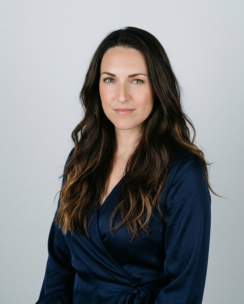
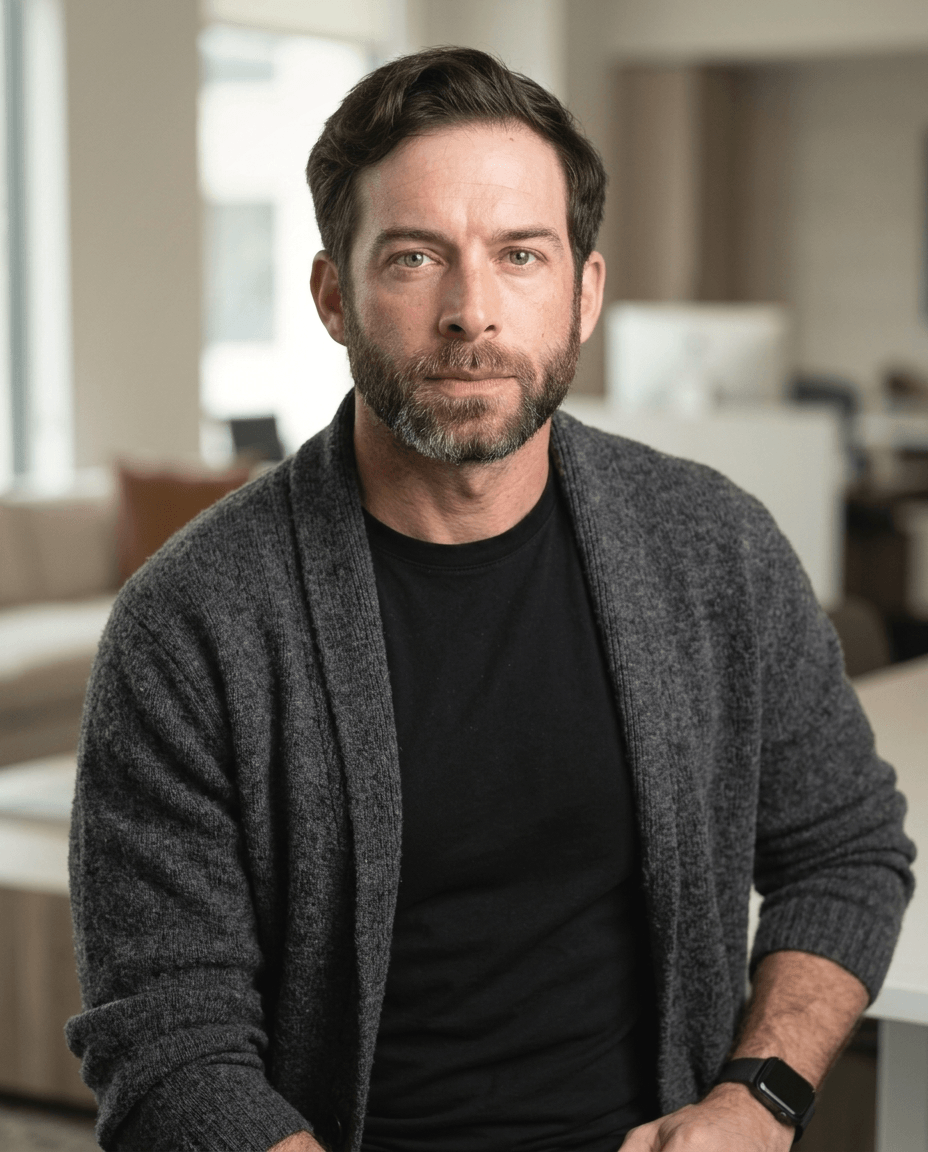
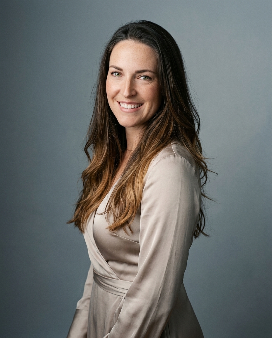
Eight LinkedIn photo styles fail for one reason more often than any other, they shrink badly. LinkedIn shows your profile photo in search results, comment threads, and message previews, so the image has to work as a tiny identity marker before anyone reads your headline. The strongest LinkedIn photo examples treat the face as the product. The weak ones treat the background, pose, or outfit as the point.
That matters because LinkedIn has reported that profiles with a photo get about 21 times more profile views and up to 36 times more messages than profiles without one, with connection requests cited at as much as 9 times in professional guidance based on LinkedIn-reported data (Snappr's summary of LinkedIn photo performance). Those figures are engagement signals, not guarantees. Still, they show why a profile photo deserves the same care as a headline or summary.
Studio Pod has photographed more than 10,000 professionals in Houston since 2019, and the patterns below come from that work. We built AiHeadshots as photographers first, not a software team retrofitting open models. That matters because the best result is not just a clean image, it's a photo that reads as credible at thumbnail size and still looks like you in a real meeting.
Table of Contents
- 1. Classic head-and-shoulders on a solid backdrop
- 2. Smart-casual with an open collar
- 3. Environmental portrait at work
- 4. Outdoor natural light portrait
- 5. Tight crop close-up
- 6. Solid brand color backdrop
- 7. Monochrome black and white portrait
- 8. Shoulder-angle portrait with direct eye contact
- 8-Point LinkedIn Photo Comparison
- Pick one style, then test it at thumbnail size
1. Classic head-and-shoulders on a solid backdrop
This is the default for a reason. A mid-chest crop, eyes near the upper third, and a plain gray, white, or soft blue backdrop gives LinkedIn exactly what it wants, a face that stays readable when the platform compresses it down to a tiny avatar. Corporate directory photos at large firms and law firm partner pages still lean on this format because it keeps the attention on the face, not the set.
Practical rule: If the background competes with the face, the photo is already failing.
The framing is simple. Keep the top of the head in frame with a little headroom, and make sure your shoulders don't disappear into the crop. A backdrop that contrasts with your clothing matters more than a fancy studio wall. If your shirt and background blend together, the silhouette vanishes on mobile.
This is also the safest place to start if you want a profile image that translates across industries. Traditional studio photography for this setup often runs $300 to $600+ for a single session, while AiHeadshots pricing starts at $29 and generates studio-style options from 10 to 20 phone selfies without a studio visit. For teams that need consistency, that difference is hard to ignore.
Carousel and ad dimension reference is useful here only as a reminder that small-format viewing dominates on-platform use.
2. Smart-casual with an open collar
This version keeps the same tight framing but drops the tie and sometimes the jacket. It reads as approachable without slipping into casual snapshot territory, which is why product managers, designers, consultants, and founders use it so often. Engineering leaders at software companies do this well when the rest of the profile still signals competence.
What makes it work
The clothing has to stay crisp. An open collar only works if the lighting stays clean and the shirt lines stay sharp, because relaxed clothing does not forgive soft focus or muddy shadows. A solid-color shirt or knit top also holds up better than busy patterning when LinkedIn shrinks the image.
This style fails when the formality drifts too far from the rest of the profile. If the headline reads like a senior operator and the photo looks like a weekend coffee shop portrait, the mismatch is obvious. Match the headshot to the tone of the About section and role title, not just your personal taste.
If you want a practical wardrobe baseline, this LinkedIn headshot clothing guide gives a clean starting point. The real test is whether the collar line sits neatly under the jaw and the face still owns the frame at thumbnail size.
3. Environmental portrait at work
An environmental portrait shows you in context, office, lab, clinic, workshop, or studio, with the setting visible but softened. It is the most specific of the LinkedIn photo examples, because it tells viewers who you are and where you work. Hospital staff pages and architecture firms use it because the setting reinforces the role.
Light direction decides whether this style feels polished or busy. Keep the key light soft and from the front or a slight side angle, then place the subject several feet from the background so the room falls out of focus. The face should stay the brightest and sharpest area in the frame. A cluttered background turns the image into a workplace snapshot.
Practical rule: If the viewer studies the room first, the room is too loud.
Crop matters next. A medium crop that keeps enough of the setting visible works for team pages and speaker bios, while a tighter crop is safer if the background has tools, paperwork, or branded items that can age quickly. The expression should stay direct and calm. Too much performance pulls attention away from the context.
Use this style as a secondary image when a neutral profile photo does the main job. It works best on about pages, team pages, or speaker bios. It fails when the room contains internal documents, inaccurate branding, or details that date the image too fast. The backdrop should support the role, not compete with the face.
4. Outdoor natural light portrait
Natural light portraits work because they feel human and immediate. Open shade or soft window light outdoors gives skin more dimension than flat indoor light, and the result reads as personal without looking informal. Real estate agents often use this style to reinforce local presence, and coaches or therapists use it to project warmth.
Direct sun is the mistake. It throws harsh shadows under the eyes and nose, and those shadows get worse when the image is compressed for LinkedIn. Overcast conditions or open shade are the cleanest choices because the light wraps around the face instead of cutting across it.
Soft light always beats dramatic sunlight for LinkedIn. Strong shadows look cinematic in a gallery. They look tired in a profile thumbnail.
Keep the background plain. A brick wall, foliage, or a neutral exterior surface works. A busy sidewalk, parked cars, or a bright street scene pulls the frame apart and weakens the portrait. This style succeeds when the face is still the clear anchor, even though the setting feels less staged.
This outside-headshot guide is worth reading if you want the practical logic behind shade, angle, and background control. The rule is simple, side light on the face, no overhead glare, and no visual clutter behind the subject.
5. Tight crop close-up
A tight crop removes the shoulders and brings the face closer to the viewer. It works because LinkedIn already circles the image, so a tighter composition keeps the face large and readable in the places that matter most. Personal brand creators and podcast hosts use this because small thumbnail recognition matters to them.
The risk is obvious. Crop too tight and the head touches the edges of the frame, which makes the photo feel cramped. Leave a little headroom and test the crop inside a circle before you upload it. The eyes should still feel central, but the frame should not fight the face.
When this format wins
It works best for people whose face is the brand, creators, hosts, founders, and visible operators with frequent posting. It fails when the face is partially hidden, the jawline is clipped, or the crop is so aggressive that it looks accidental. A close crop should feel deliberate, not improvised.
Keep a wider version for company pages and email signatures. The point is not to force one crop into every channel. The point is to preserve clarity where the platform shrinks you the most.
6. Solid brand color backdrop
A solid brand color backdrop uses one color from the company palette behind the subject, usually navy, teal, or deep green. It works well for corporate teams because the directory stays coherent while each person still looks distinct. Agencies and enterprise HR teams use it for that reason.
Color choice does the heavy lifting. The backdrop has to separate the subject from the clothing, so keep it away from shirts and blazers in a similar tone. Pull the exact hex from brand guidelines, then test it against the outfit before you shoot a full team set.
One background color per team keeps the directory uniform. One color per person turns consistency into noise.
This format suits executives, recruiters, sales leaders, and client-facing staff who need a shared visual system. It fails when the palette is so strong that it swallows the face or washes out skin tone. The portrait still needs to read as a portrait.
For the background itself, see this background guide. It keeps the color choice intentional without adding clutter to the frame.
7. Monochrome black and white portrait
Black and white strips away color and leaves tone, contrast, and texture to do the work. That gives the portrait a timeless, editorial feel that suits executives, lawyers, and authors especially well. Law firm partner pages use it because it feels serious. Author bios use it because it feels composed.
The face still needs direct eye contact and clean edges. Monochrome doesn't rescue a weak expression or a sloppy crop. It also hides color differences across a mixed-source team set, which makes it useful when photos come from different sessions or devices.
The cleanest version is usually retouched in color first, then converted to black and white. That keeps the skin tone even before the color is removed. Strong contrast should be used with restraint, because heavy contrast eats detail in the shadows and makes the face look harsher than intended.
This style fails when people use it to hide a weak image instead of to sharpen a strong one. Monochrome is not a shortcut. It's a finishing decision.
8. Shoulder-angle portrait with direct eye contact
This is one of the most effective poses in professional portraiture. The body turns about 30 degrees from the camera, then the head turns back to the lens. That small offset adds depth without breaking the direct connection that LinkedIn photos need.
Sales leaders and founders use this angle because it signals presence. The shoulders create shape, and the eye contact keeps the image anchored. It is a better choice than a flat straight-on pose when you want a little movement in the frame without losing clarity.
The failure point
The pose breaks when the chin drops too low or the eyes lose sharpness. A lowered chin reads as defensive, and soft eyes make the whole image feel distant. Turn the shoulders first, then bring the head back to the camera, and check both eyes at full resolution before you choose the frame.
This pose works because it balances control and openness. It fails when the body angle becomes theatrical or the gaze drifts away from the lens. Keep it simple. Let the posture add dimension, not drama.
8-Point LinkedIn Photo Comparison
| Style | 🔄 Implementation Complexity | ⚡ Resource / Cost | 📊 Expected Outcomes | Ideal Use Cases | ⭐ Key Advantages / 💡 Tips |
|---|---|---|---|---|---|
| Classic head-and-shoulders on a solid backdrop | Low, standard pose and crop | Medium–High, studio $300–$600+; AI options ~$29 | Clear, recruiter-friendly thumbnails and profile images | Corporate directories, law, professional services | Reliable professional look; tip: 400×400px min and 5–10% headroom |
| Smart-casual with an open collar | Low, same framing, simple wardrobe change | Low, phone or basic studio, no formal wardrobe | Approachable yet professional; stands out among suits | Tech, startups, designers, founders, consultants | Signals approachability; tip: pick solid colors and check collar lines |
| Environmental portrait at work | High, location setup and controlled depth of field | Medium, on-location time and possible permissions | Conveys role/context; highly specific and differentiating | Clinicians, architects, tradespeople, researchers | Communicates what you do; tip: soften background and remove logos |
| Outdoor natural light portrait | Medium, needs open shade and timing control | Low–Medium, no studio gear but weather dependent | Warm, natural, approachable tone with dimensional skin tones | Coaches, consultants, real estate professionals | Flattering and human; tip: use open shade, avoid midday sun |
| Tight crop close-up | Low, simple crop but requires precision | Low, phone or studio shot, minimal resources | Maximizes face size in circular avatars; strong at small sizes | Personal brands, podcast hosts, creators | High thumbnail recognition; tip: leave ≥5% headroom and test in a circle |
| Solid brand color backdrop | Medium, requires color matching and consistent lighting | Medium, backdrop, lighting, brand guidelines | Cohesive company presence and easier team updates | Enterprise HR, agencies, team directories | Strong visual consistency; tip: use exact hex and test clothing contrast |
| Monochrome black and white portrait | Low–Medium, conversion and contrast control | Low, post-processing focused | Timeless, editorial look; hides color inconsistencies across sets | Executives, lawyers, authors, senior bios | Editorial and consistent; tip: convert after retouching and keep eyes brightest |
| Shoulder-angle portrait with direct eye contact | Medium, pose guidance and small adjustments | Low–Medium, standard shoot with directed posing | Adds depth and engagement while remaining clear | Sales leaders, founders, client-facing roles | Dynamic and engaging; tip: turn shoulders first, then head and keep chin level |
Pick one style, then test it at thumbnail size
Choose the style that fits your role and industry, then check the photo inside a circle at 400 x 400 pixels before you upload it. LinkedIn accepts profile photos from 400 x 400 pixels up to 7,680 x 4,320 pixels, with a maximum file size of 8 MB, and it supports JPG and PNG only (LinkedIn photo size and format guidance). That means the true test is not how the image looks large, it's how it survives the crop.
If you want proof instead of guesswork, compare your current image against the strongest version at the same size. The cleanest metric is whether the face still reads clearly when the photo is tiny. For teams, that matters even more, because a directory looks stronger when each person is recognizable at a glance.
Privacy settings matter too. LinkedIn lets you control photo visibility for 1st-degree connections only, your network, all LinkedIn members, or anyone (LinkedIn photo visibility settings). The public profile setting defaults to Public, and you can change or hide it if you want the image visible only inside the network (LinkedIn public profile controls). That gives you room to keep a polished headshot professional without making it universal.
AiHeadshots fits this use case because it comes from Studio Pod, the Houston studio team that has shot 10,000+ real professionals since 2019. It delivers 30+ studio-grade headshots in about 30 minutes, from 10 to 20 selfies, with a 100% money-back guarantee within 14 days. For a quick style test across your own LinkedIn options, that is a practical way to compare crops, expressions, and backdrops without booking a studio day.
Upload 10 selfies at AiHeadshots, and see your first LinkedIn-ready headshot in about 30 minutes. You'll get multiple styles to compare, including neutral, branded, and professional looks that fit the examples above. Start with the crop that matches your role, then check it at thumbnail size before you post.