
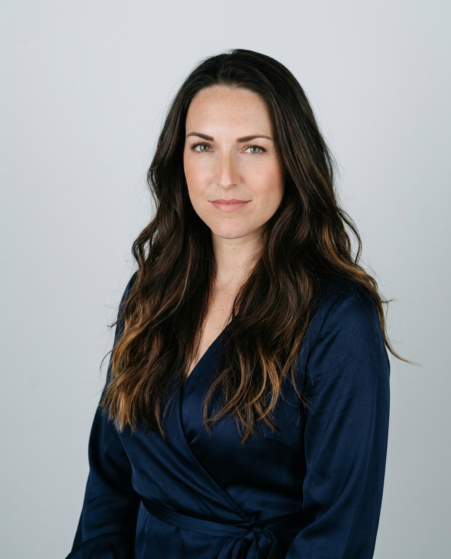

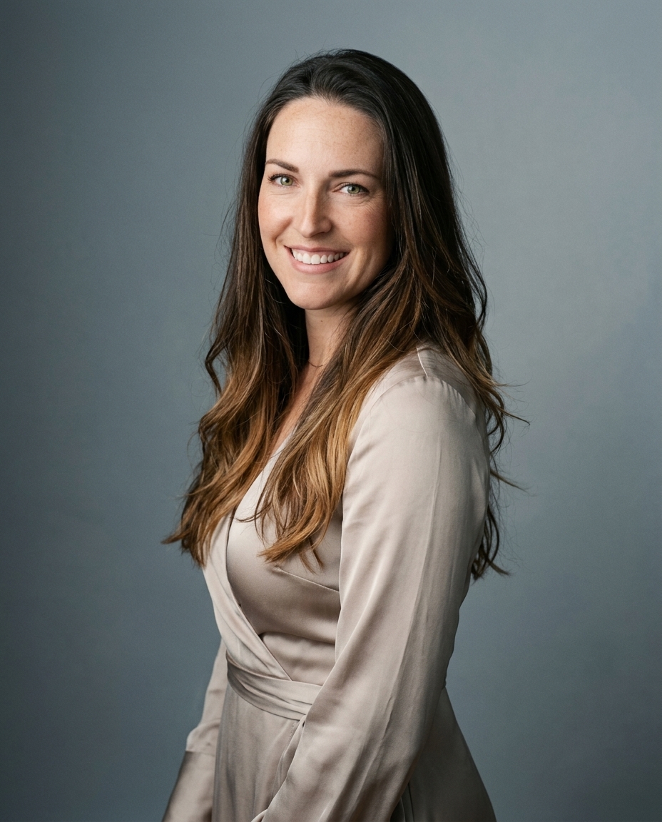

Soft neutral gradients are the strongest all-purpose choice for LinkedIn headshots. The right alternative depends on your profession, the amount of context you want to show, and whether the image needs to work consistently across a team.
The background sets the professional signal before anyone reads your headline. A quiet cream-to-gray fade keeps attention on your face, survives the small circular crop, and works for conservative fields as well as creative roles. A blurred office can show authority through context. A deep blue backdrop can create a coordinated corporate identity. An outdoor setting can feel approachable, but only when the light and composition are controlled.
The best backgrounds for LinkedIn aren't chosen because they look impressive in isolation. They're chosen because they support credibility, facial separation, cropping, and brand consistency. LinkedIn's profile photo is square, with a widely cited recommended size of 400 × 400 pixels from LinkedIn image sizing guidance. The banner behind it uses 1584 × 396 pixels at a 4:1 aspect ratio, according to LinkedIn's official image specifications.
A polished result also depends on lighting, expression, edge quality, and realistic integration. At AiHeadshots, we approach those details as photographers first. Studio Pod, our Houston-based automated headshot studio, has photographed 10,000+ real professionals since 2019. AiHeadshots was built by photographers Joseph West and Chris Bailey, not by a software team retrofitting open models.
Table of Contents
- 1. Soft neutral gradient backgrounds
- 2. Blurred office or workspace backgrounds
- 3. Professional colored backdrops
- 4. Branded or patterned backgrounds
- 5. Outdoor and natural light backgrounds
- 6. Minimalist or negative space backgrounds
- 7. Lifestyle and contextual backgrounds
- 8. Abstract and artistic backgrounds
- Top 8 LinkedIn Backgrounds Comparison
- Choose one visual system and use it consistently
1. Soft neutral gradient backgrounds
A soft neutral gradient is the safest starting point for most LinkedIn profiles. It uses a restrained transition, such as cream into soft gray or pale blue into white, to create depth without turning the background into a subject.
The style feels more intentional than a flat passport-style wall. It also avoids the visual noise of a workplace, street, or branded pattern. A lawyer, financial adviser, management consultant, or senior technology executive can use it without sending the wrong signal. The same treatment works for a designer or founder who wants personality to come from clothing and expression rather than scenery.
Why the gradient works
A gradient gives the eye a gentle tonal path. That helps separate the head and shoulders while preserving a studio look. A solid color can work well, but a carefully controlled fade reduces the risk of looking flat.
Use a gradient that contrasts with your hair. Dark hair can disappear against charcoal or navy. Light hair can lose definition against white or pale gray. The transition should be smooth. Banding, striping, or obvious digital texture reads as an unfinished edit.
Keep yourself roughly 12 to 18 inches from the background plane when shooting in a physical studio. That distance creates natural falloff around the shoulders. With a generated portrait, the same principle still matters visually. The background should soften around the subject rather than form a hard cutout.
Practical rule: Check the image at thumbnail size on your phone. If the gradient becomes a stripe or the hair loses separation, simplify it.
Tech executives at Microsoft, Apple, and Google commonly use restrained blue-to-white visual treatments. Legal professionals often suit gray or warm-cream fades, while consultants tend to favor light neutral transitions. Those choices work because the background supports the role instead of competing with it.

2. Blurred office or workspace backgrounds
A blurred office adds context without requiring the viewer to study the room. Desks, shelves, windows, and collaborative spaces become supporting shapes. Your face remains the focal point, but the setting communicates that you work in a real professional environment.
This background suits architects, therapists, startup founders, coaches, real estate agents, and remote professionals. A founder photographed in a workspace suggests ownership and activity. A therapist in a calm office creates a more personal impression than a plain gray backdrop. An architect can show the edge of a studio while keeping drawings and equipment soft in the distance.
The trade-off is control. A workspace that looks authentic in person can become distracting in a small profile image. Cords, clutter, bright screens, and random objects pull attention away from the face. Remove them before the shoot rather than trying to rescue the image later.
Create blur with distance and light
For a physical shoot, place yourself 3 to 6 feet from the background. A wide aperture, such as f/2.0 or wider, creates stronger separation when the camera and lens support it. Smartphone portrait mode can work, but inspect the edges around hair, glasses, and shoulders. Poor masking makes a portrait look artificial.
Window light is usually the cleanest option. Face the window instead of placing it directly behind you. The light should shape the face without creating harsh shadows or a bright blown-out background.
For teams, consistency is harder. Everyone should use the same location, camera direction, subject distance, and level of blur. Otherwise, one employee will appear in a bright modern office while another looks as if they were photographed against a dim living room.
A remote-first company such as Slack or Zapier can make a home-office background feel appropriate. A real estate agent can use a softly blurred modern office or property setting. The choice works only when the environment belongs to the professional identity.

This blurred home-office headshot example shows how context can remain visible without overpowering the subject.
3. Professional colored backdrops
Deep blue, burgundy, charcoal, and dark teal create a deliberate studio identity. These colors sit between a neutral gradient and an environmental portrait. They add visual distinction while keeping the image formal.
Deep blue works naturally for enterprise software, finance, and technology. Charcoal supports authority in legal and executive settings. Burgundy can feel more refined, which suits luxury services and certain professional firms. Teal can add a modern note for health technology and medical practices.
The color must serve the person. Test it against hair, skin tone, and wardrobe before standardizing it. Dark hair against charcoal can lose its edge. A navy jacket against a navy background can flatten the entire portrait. Light shirts, muted jackets, and controlled contrast usually produce a cleaner result.
Best for coordinated teams
Colored studio backgrounds are particularly useful for company galleries. Every employee can share the same tonal system, which makes the team look organized across LinkedIn, company pages, proposals, and speaker biographies. Shoot everyone under the same lighting setup if possible. Small differences in exposure can make one person's navy look blue and another's look almost black.
Even lighting matters more with saturated backgrounds. Uneven illumination creates hotspots and shadows that look accidental. The background should read as a consistent field, not a wall with visible lighting problems.
For a deeper look at choosing and controlling blue tones, see this guide to a blue background for professional photos.
A colored backdrop isn't automatically more memorable. It works when the shade reinforces the industry and contrasts clearly with the subject. It fails when the color is chosen for novelty, clashes with clothing, or makes a whole team look like unrelated portraits.
4. Branded or patterned backgrounds
A branded background turns an individual portrait into a company asset. It can include a muted brand color, a geometric motif, a subtle texture, or a restrained wordmark. Creative agencies, startups, venture firms, accelerators, and design-led companies often have the strongest reason to use this approach.
The benefit is consistency. A team gallery with one visual language looks intentional. Every portrait reinforces the company without requiring the viewer to visit a separate brand page. The risk is overbranding. A large logo behind someone's head makes the portrait feel like an advertisement rather than a professional profile.
Keep the identity quiet
Use brand colors, but reduce their intensity. Avoid neon backgrounds and highly saturated fields unless the company's identity depends on them. A muted pattern generally supports a face better than a loud one.
A logo or pattern should remain secondary. Test it with different hair colors, skin tones, jackets, and shirt colors. A design that works behind one executive can merge with another employee's hair or create harsh contrast around the face.
Text also needs discipline. A company name or wordmark is clearer in social feeds than an isolated symbol, but it still needs generous space. Keep the face and shoulders free from important design elements. For a profile photo, the subject takes priority over the mark.

This approach can complement wider visual campaigns, including AI fashion photography, when the broader brand system already uses coordinated colors and patterns.
Branded backgrounds work best when the company has a clear visual identity and someone owns the standard. Without that governance, employees often upload different logo sizes, colors, and placements. The result looks less consistent than a simple neutral background.
5. Outdoor and natural light backgrounds
Outdoor backgrounds communicate approachability and real-world energy. Parks, rooftops, architectural details, greenery, and city streets can suit freelancers, designers, wellness professionals, founders, coaches, and location-based specialists.
The background should explain something about the person. A designer near an urban wall feels more credible than a generic beach portrait. A wellness coach in a quiet park can create a calm, human impression. A real estate agent near a recognizable local setting can connect the portrait to the market they serve.
Outdoor portraits fail through poor timing. Harsh midday light creates hard shadows and squinting. A cluttered street competes with the face. A forced pose makes the image look like a casual snapshot rather than a professional portrait.
Control the environment
Shoot during the first hour after sunrise or the hour before sunset. The light is softer and more forgiving. Scout the location beforehand at the same time of day, because a background that looks quiet in the morning can become crowded later.
Use brick, architecture, or greenery as framing elements. Keep them behind the subject and soften them with a wide aperture, such as f/2.0 or wider, when your equipment allows. Dress for the location. Neutral and jewel-tone clothing usually works across outdoor settings, while bright white can lose detail in sunlight and neon can dominate the frame.
Natural posing matters. Shift your weight, lean slightly, or turn the shoulders instead of holding a rigid stance. The expression should remain direct and professional.
For more practical direction, review this guide to professional headshots outside.
Outdoor backgrounds are a poor default for teams unless every employee can use a comparable setting. Different weather, light, architecture, and foliage quickly destroy visual consistency.
6. Minimalist or negative space backgrounds
A minimalist background removes almost everything except the person. White, off-white, and very pale tones create a clean field that feels modern and controlled. This is the strongest choice for people whose expression, wardrobe, or personal brand carries the portrait.
Luxury consultants, private wealth professionals, executive coaches, founders, creative directors, and high-fashion professionals often suit this treatment. The restraint can signal confidence. It says the portrait doesn't need scenery or decoration to establish importance.
The weakness is technical exposure. White backgrounds reveal uneven lighting, gray corners, hard shadows, and poor retouching. A plain wall isn't automatically a minimalist studio. It can look dingy or yellow if the light is inconsistent.
Protect facial separation
Use professional lighting or at least multiple controlled light sources. The face needs dimension, and the background needs to remain clean. Position the subject 12 to 18 inches away from the background to create subtle separation.
Wardrobe becomes more important here. Dark or saturated clothing creates definition against white. Pale pastels can disappear. Light hair also needs care. A slightly warmer off-white can preserve separation better than a cool white field.
Retouching should stay realistic. Small marks become more visible against a pale background, but excessive smoothing damages texture and credibility. The finished portrait should look like the person on a good day, not like a plastic composite.

Minimalist backgrounds also perform well across company materials because they don't fight with different profile layouts. They're less suitable when your professional value depends heavily on a visible environment, such as a chef, carpenter, or studio-based designer.
7. Lifestyle and contextual backgrounds
A lifestyle background shows what you do. A lawyer can appear in a law library. A chef can stand in a working kitchen. A developer can use a restrained coding environment. A personal trainer can be photographed in a gym.
This style is more specific than a generic office and more personal than a branded backdrop. It gives the viewer a visual clue about your expertise. That makes it especially useful for solopreneurs, coaches, creatives, tradespeople, musicians, and specialists whose environment forms part of their public identity.
Authenticity controls the result. A borrowed studio that only looks like your profession creates a mismatch. A real workspace, cleaned and arranged carefully, usually feels more convincing.
Show context without losing the face
Keep props to two or three meaningful items. A carpenter needs a workshop detail, not every tool in the room. An interior designer can show samples or a mood board, but the materials shouldn't cover the frame. A musician can include an instrument, provided it doesn't block the shoulders or face.
Use shallow depth of field when possible. An aperture of f/2.0 or wider keeps the setting recognizable while preserving facial priority. Dress in a way that fits the environment without turning the portrait into a costume.
Clean the location before photographing. Remove irrelevant equipment, cables, food containers, and personal clutter. A professional headshot should show a working environment, not the entire contents of a room.
These decisions align with the broader guidance in professional image tips for headshots. The background should add evidence of your work, not ask the viewer to decode a crowded scene.
8. Abstract and artistic backgrounds
Abstract backgrounds use geometric shapes, color fields, artistic textures, or architectural patterns. They're the boldest option here. Designers, artists, creative directors, UX professionals, architects, and innovation-focused founders can use them to signal visual thinking.
An abstract composition says something without showing a literal workplace. Color blocking can suit a creative director. A structural pattern can support an architect. A restrained painted texture can work for an illustrator.
The trade-off is context. A creative background that feels distinctive on a portfolio site can look gimmicky on a lawyer's LinkedIn profile. It can also compete with the face, especially after LinkedIn compresses the image into a small circular crop.
Make the abstraction earn its place
Choose a pattern that belongs to your existing visual identity. Don't borrow a trendy treatment that appears nowhere else in your work. Use one or two design elements, not a collection of unrelated shapes.
Contrast remains essential. Wear neutral clothing or a complementary color so the background supports the portrait. Test the image on desktop and mobile. Fine patterns can compress into visual vibration, while high-contrast lines can pull attention away from the eyes.
An abstract background can also serve a creative team, but only if everyone uses the same palette and composition rules. Otherwise, the gallery becomes a collection of unrelated personal experiments.
For social content that needs motion rather than a static profile portrait, this resource on animated abstract backgrounds for social media offers a related visual direction. LinkedIn profile photos themselves still need to remain clear, stable, and easy to recognize.
Top 8 LinkedIn Backgrounds Comparison
| Background style | 🔄 Implementation complexity | ⚡ Resource requirements | ⭐ Expected outcomes / Key advantages | 📊 Ideal use cases | 💡 Quick tip |
|---|---|---|---|---|---|
| Soft neutral gradient backgrounds | Low, simple digital or basic studio setup | Low, minimal lighting and basic editing | Professional, timeless; draws attention to face | Corporate profiles, executives, consultants | Ensure smooth gradients; contrast with hair; test on mobile |
| Blurred office or workspace backgrounds | Medium, requires shallow depth of field and staging | Medium, wide-aperture lens or portrait mode; tidy space | Authentic, contextual; memorable workplace cue | Remote workers, architects, therapists, founders | Position 3–6 ft from background; use f/2.0 or portrait mode |
| Professional colored backdrops (deep blue, burgundy, charcoal) | Medium–High, studio lighting and color control | Medium–High, solid backdrops, even lighting, color testing | Strong separation; polished and easy to standardize for teams | Corporate teams, finance, exec portraits, enterprise | Pick industry-appropriate hues; test against skin/hair; light evenly |
| Branded or patterned backgrounds | High, requires design templates and restraint | High, design work, template rollout, consistent production | Reinforces brand identity; cohesive team assets at scale | Agencies, startups, marketing, VC firms with teams | Keep logos muted (20–30% opacity); mute brand colors; test readability |
| Outdoor and natural light backgrounds | Medium–High, location scouting and light control needed | Medium, time, timing (weather), possible lighting aids | Approachable, warm, story-driven; differentiates from studio shots | Creatives, wellness coaches, entrepreneurs, location-based pros | Shoot golden hour; scout locations; use wide aperture to blur clutter |
| Minimalist or negative space backgrounds | Medium, precise lighting required to avoid flatness | Medium, professional lighting and retouching recommended | Maximum focus on subject; modern and timeless | Luxury brands, executives, personal brands, thought leaders | Invest in lighting/retouching; keep 12–18 in separation from background |
| Lifestyle and contextual backgrounds | High, styling, props, and composition required | High, location setup, props, cleaning, and direction | Communicates what you do quickly; builds trust and recall | Solopreneurs, trades, coaches, creatives, specialists | Limit props to 2–3; prioritize authenticity; use shallow DOF |
| Abstract and artistic backgrounds | High, design skill to balance art and portrait | Medium–High, custom design and cross-platform testing | Highly memorable; signals creativity but can be risky | Designers, artists, creative directors, innovation leaders | Use muted palettes, ensure subject contrast; test on mobile |
Choose one visual system and use it consistently
The best background depends on the professional signal you need to send. Choose a soft neutral gradient or minimalist backdrop when you want broad credibility across industries. Choose a deep colored studio background when your firm needs coordinated portraits. Use a blurred office when the environment adds authority. Select a lifestyle or abstract background when personality, craft, or creative thinking forms a central part of your work.
The background also needs to work with LinkedIn's interface. The platform partially obscures the banner with the circular profile photo, and it crops the banner differently on desktop and mobile. LinkedIn's official guidance therefore supports keeping critical content away from the lower-left overlap area and preserving a clean center-right zone. Small text also suffers after compression, especially on mobile, so a background that looks detailed on a large monitor can become unreadable in a profile card.
A team should choose its visual system before collecting images. This matters particularly at 10+ seats, where inconsistent backgrounds become obvious across employee profiles. AiHeadshots' Teams tier offers volume pricing of $22 to $29 per seat for that kind of coordinated rollout. Individual tiers include Basic at $29, Professional at $39, and Executive at $59. Each provides 30+ studio-grade headshots delivered in approximately 30 minutes, using 10 to 20 phone selfies and no studio visit.
Use this practical consistency check before approving a set:
- Crop: Keep the same head-and-shoulder framing and leave enough space for LinkedIn's circular crop.
- Lighting direction: Match the apparent light source across employees.
- Contrast: Make sure hair, clothing, and face edges separate from the background.
- Color palette: Use one controlled family, such as neutral gray, warm beige, charcoal, navy, or soft blue.
- Background treatment: Don't mix sharp offices, heavy blur, outdoor scenes, and flat studio colors without a clear reason.
- Mobile review: Inspect every final image at small size, not only on a desktop monitor.
AiHeadshots is built from Studio Pod's photography heritage. Joseph West and Chris Bailey founded Studio Pod in Houston and have photographed 10,000+ real professionals since 2019. AiHeadshots has served 30,000+ customers, delivered 255,000+ headshots, and holds a 4.9-star rating. The system produces profile-ready options with neutral backgrounds such as charcoal, warm beige, and light gray, as well as other background styles suited to different professional identities.
Data handling is defined by retention windows. Input images are retained for 7 days, generated outputs for 30 days, and billing data for 90 days. A 100% money-back guarantee within 14 days gives individuals and teams a clear way to evaluate the result against their visual standard.
Upload 10 selfies, see your first headshot in 30 minutes, $29.
AiHeadshots gives you 30+ studio-grade headshots with neutral, branded, and contextual background options, without a studio visit. Upload your phone selfies and visit AiHeadshots to choose a background system that fits your LinkedIn profile or team.