
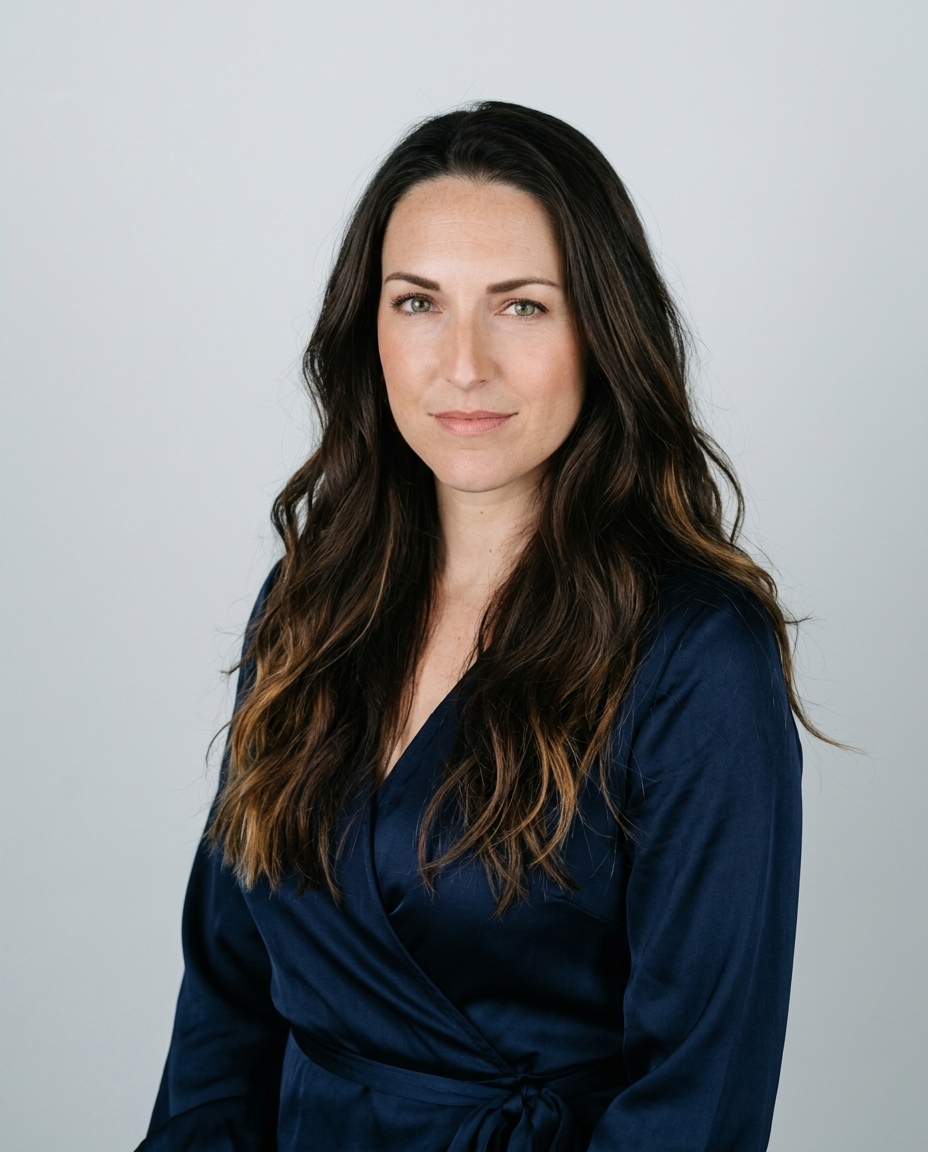

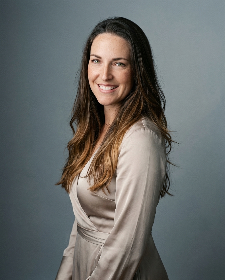

A blue background for photo work fails most often because people treat blue like a default, not a decision. In headshots, that's the wrong order. A subject fills the frame, the background sits close to the face, and the shade has to work with skin, wardrobe, crop, and lighting at once.
That's why the blue backgrounds that look clean in a studio can still fail on a LinkedIn crop, a company directory, or a remote AI-generated headshot. The problem isn't blue itself. The problem is choosing the wrong blue for the person, the platform, and the light.
For a useful outside reference on how working photographers think about headshot backgrounds, studio headshots by Flexwork is a solid place to compare approaches. The bigger reality is cost. A traditional photographer session often runs $300 to $600+ for a single sitting, while AiHeadshots has a $29 entry tier and a $39 Professional tier that delivers 30+ studio-grade headshots in about 30 minutes with no studio visit.
Table of Contents
- Why most blue backgrounds fail at the headshot level
- Picking the blue shade that fits the subject
- Backdrop type by shoot scenario
- Lighting and camera setup for a clean blue background
- Wardrobe, contrast, and crop for each platform
- Retouching, export, and the digital shortcut
- The short decision framework
Why most blue backgrounds fail at the headshot level
The most common mistake is simple. Someone picks any blue, then assumes the job is done. In real headshots, that usually produces a background that fights the face, flattens skin tone, or looks too heavy once the crop tightens around the head and shoulders.
The default blue is usually chosen for convenience
Blue is forgiving in many kinds of photography because it can sit behind the subject without taking over. Headshots are different. The face occupies more of the frame, the background has less room to breathe, and every shift in saturation shows up next to skin and clothing.
A clean blue background only works when it is chosen for the person in front of it. That means the shade, distance, and light all have to line up. A soft blue can calm the image. A harsh one can make the subject look disconnected from the frame.
Practical rule: if the background is there just because it was already hanging in the studio, you're probably making the wrong choice.
The wider industry keeps repeating the same lesson in different ways. Blue backgrounds are popular because they read as polished and familiar, but that popularity is exactly why they get used without enough judgment. The result is a lot of generic portraits and not enough images that feel intentional.
For business photography, that matters. A professional headshot isn't trying to show off the backdrop. It's trying to hold attention on the person. Blue works only when it supports that goal instead of competing with it.
Headshot work exposes the weak spots fast
Across 10,000+ real professionals photographed at Studio Pod since 2019, the blue backgrounds that failed were the ones picked for speed, not fit. That's the pattern behind bad blue. It wasn't the color. It was the shortcut.
The better question is not whether you should use blue. It's which blue, for which person, under which light, and for which use case. That's the working question behind every good blue-background portrait, whether it's made in a studio or through a digital workflow like AiHeadshots.
Blue is a tool, not a style by itself. The subject decides whether it works.
Picking the blue shade that fits the subject
Blue is not one color in practice. It's a family of shades, and the shade you pick changes how skin reads, how wardrobe separates, and how the portrait feels on screen. The easiest way to sort the options is by four working groups: sky blue, royal or cobalt, navy or midnight, and teal-leaning blue.

Match the shade to the subject first
Sky blue is the lightest choice. It feels open and soft, and it works well when the subject has lighter, cooler styling or when the goal is a friendlier, less formal headshot. It can wash out if the clothing is pale too, so it needs stronger wardrobe contrast.
Royal or cobalt is the classic business choice. It sits in the middle, reads clearly on LinkedIn, and gives enough color to feel deliberate without becoming heavy. This is the safest blue for many corporate portraits because it separates well from skin and still survives a cropped frame.
Navy or midnight leans executive. It gives a more serious tone, and it is strongest when the subject's face needs to stay crisp against a darker field. Very dark blues can lose detail in compression, so they work best when the lighting keeps the background from turning muddy.
Teal-leaning blue feels more design-led. It suits brands that want something modern, especially when the wardrobe already includes warm neutrals or rich textures. It can look sharp, but it needs discipline. Too much green in the blue can start to read as a different color family entirely.
The color contrast principle is straightforward. Blue is a cool color, and warm subjects, especially orange, yellow, or red undertones, pop against it. That's why warm neutrals and jewel tones usually separate better than blue-on-blue styling.
Working preference: blue backgrounds flatter contrast, not sameness. If the shirt and the backdrop are cousins, the face disappears.
Use saturation with intent
Very saturated blues feel strong in print and on executive portraits, but they can lose nuance once a platform compresses the image. More muted blues keep detail better and feel calmer in a small profile crop. That's why a mid-saturation blue usually carries more flexibility than pure, hard blue.
For reproducibility, pure blue in digital color systems is HEX #0000FF, with RGB 0,0,255 and HSL 240,100,50, and its dominant wavelength sits around 450–495 nanometers (digital color values and wavelength reference). In practice, most professional backdrops sit below full saturation because the goal is not a neon block of color. The goal is a portrait that still looks natural after lighting, editing, and crop.
Backdrop type by shoot scenario
The backdrop material matters as much as the shade. A blue background for photo work can be made with paper, fabric, vinyl, collapsible systems, or a digital background workflow. Each one solves a different problem, and each one fails in a different way.
Choose the material by mobility and consistency
Paper is the studio standard when you want a flat, clean field of color. It's fast to read on camera and easy to light evenly. The tradeoff is that it lives in one place and shows wear once it's used hard.
Fabric or muslin travels well, which makes it useful for portable shoots. The weakness is wrinkling. Heat and handling turn a smooth background into a texture problem, and texture creates uneven blue on camera.
Vinyl and collapsible disks are the practical mobile option. They stay more consistent than fabric and are easier to keep looking clean from shoot to shoot. They're a good fit for on-location work where time matters and the setup has to move.
Digital generation is the answer when the subject can't get to a studio, or when the deadline is measured in hours rather than days. That's where AiHeadshots fits naturally. It's the remote option that keeps the blue-background look without requiring a physical set.
Here's the cost and use-case comparison at a glance.
| Backdrop type | Typical cost | Setup time | Best use case |
|---|---|---|---|
| Seamless paper | A 9 ft Savage roll is roughly $40–$80 for a single session | Fast in studio | Controlled brand shoots, styled headshots |
| Fabric or muslin | Varies by fabric and support system | Moderate | Portable sessions, lower-budget location work |
| Vinyl or collapsible disk | Varies by system | Fast | Mobile shoots, consistent on-location portraits |
| Digital with AiHeadshots | $39 Professional tier, or $29 Basic tier | About 30 minutes for delivery | Remote professionals, small teams, tight deadlines |
The studio choice usually wins when wardrobe, makeup, and art direction are all present. The digital choice wins when consistency and speed matter more than physically building the set. If you want a deeper comparison of background types, see the headshot background guide.
Lighting and camera setup for a clean blue background
A blue background turns messy fast when the light spills too far. The subject catches blue spill, the edges lose separation, and the backdrop starts blending into the person instead of staying behind them. Clean blue work starts with separation, then color control.

Start with separation, then add color
The cleanest starting point is simple. Keep ambient light off the backdrop, place blue only where you want it, and give the subject its own exposure path. A lighting demo used ISO 100, 1/200 shutter speed, and f/10, then added a blue gel to the background light while a soft key stayed on the subject. The goal was to keep ambient contamination down and hold natural skin tone (lighting demo reference).
A second technical setup used four 500 W flood lights with incandescent bulbs bounced into a large white vinyl sheet, with white balance set to 3,200 K. That arrangement pushed the background blue while keeping the shooting area natural. Same principle, different gear. Hold the background on its own, then protect the face.
Key setup habit: light the background like a background. Light the face like a face.
The common failure is spill. If the backdrop sits too close, or if the light spreads too broadly, blue contamination lands on skin and clothing. The result is weak separation and a harder retouch later. The subject needs room from the backdrop, and the light has to stay tight enough that the blue stays on the background instead of wrapping around the subject. For a broader setup comparison, see best lighting for headshots.
Keep the geometry clean
A production guide for blue-screen and cutout work recommends a backdrop curve radius of about 40 cm at the floor transition so there is no hard corner, with overall illumination of at least 2,000 lx so the blue surface stays even and shadows stay down (production guide reference). The same source also recommends keeping the subject 6 to 10 feet from the backdrop and using a two- or three-light setup with softboxes for a cleaner key.
That spacing matters because wrinkles, gradients, and reflections are the problems you can see before they become masking problems. A flat blue field is easier to retouch, easier to cut out, and easier to trust. It also gives you more room to adjust the shade later if the skin tone or wardrobe needs a different blue.
For remote work, AiHeadshots handles retouching and shade control after upload, so you can keep the blue-background look without building the set in a studio. If you want the retouching side of that workflow in more detail, this retouching guide is the useful companion read.
Wardrobe, contrast, and crop for each platform
A blue background only works if the subject doesn't disappear into it. Wardrobe, frame shape, and crop all change that outcome. The same portrait can look sharp in a directory and soft on LinkedIn, because the platform uses the image differently.
Dress against the backdrop, not with it
Avoid blue tops that match the background. If the shirt and the backdrop land in the same family, the body collapses visually and the headshot loses depth. Warm neutrals like cream, sandstone, and soft rust separate well. So do saturated jewel tones like burgundy, mustard, and forest green.
Glasses matter too. Thin metal frames usually sit cleanly against blue. Thick black frames can read as a hard line, especially on a dark navy backdrop. Jewelry should support the portrait rather than pull attention away from the face.
LinkedIn crops around 1:1.19, corporate directories often accept 4:5 or 1:1, and acting submissions commonly want 8:10 vertical or 4:5. Each format changes how much blue the viewer sees. A dark navy can read almost black under aggressive compression, while a softer sky blue survives with more clarity.
Shoot slightly wider than the final crop. The auto-crop will steal more headroom than you expect.
Match the crop to the message
A tighter crop makes the background less decorative and more structural. That means the shade has to hold up without taking over. In a profile image, there isn't much room for a dramatic backdrop to show off, so the portrait needs to do the heavy lifting.
For team directories and corporate bios, consistency beats flash. For acting submissions, the frame needs to keep the subject readable at a glance. In both cases, the blue should frame the face, not frame itself.
Retouching, export, and the digital shortcut
A blue background looks intentional only after the edit. Raw files often show gradients, uneven white balance, and tiny shifts in color that don't belong in a professional portrait. Retouching is where the background becomes a clean design choice instead of a camera accident.
Clean the blue, then protect the skin
Start by correcting white balance so skin stays natural. Then set the background to a flat color sample instead of leaving visible gradients. That keeps the blue consistent across the frame and prevents one side of the backdrop from reading heavier than the other.
Export matters too. LinkedIn wants at least 400 x 400 pixels, and executive directories often ask for 800 x 1000 (platform guidance reference). The file should match the platform rather than the camera's full resolution, because a clean crop is more useful than an oversized file that gets compressed badly.
If the subject can't get to a studio, AiHeadshots is the digital shortcut that fits the workflow. Customers upload 10 to 20 phone selfies, then receive 30+ headshots in about 30 minutes. The Professional tier is $39, the Executive tier is $59, and the Basic tier is $29. Teams get a volume discount at 10+ seats, at $22 to $29 per seat.
AiHeadshots also keeps data retention tight, with 7-day input retention, 30-day output retention, and 90-day billing retention. There's a 100% money-back guarantee within 14 days. The company is built on Studio Pod, founded by photographers Joseph West and Chris Bailey, and it has served 30,000+ customers with 255,000+ headshots delivered and a 4.9★ rating.
That heritage matters. The look comes from photographers who built an AI workflow, not a software team retrofitting generic models. If you want to see the service side by side with other options like HeadshotPro, BetterPic, Aragon, Secta, and ProPhotos, the comparison belongs in the broader decision process, not in a feature race.
The short decision framework
Start with the shade, because the wrong blue creates problems. Royal blue works for most LinkedIn headshots because it reads cleanly without pushing too much color back into the face. Navy fits executive portraits where the clothing and background need a quieter, more formal frame. Sky blue works better for lighter, more creative looks, but it needs more care with skin tone and wardrobe so the face does not wash out.
Then match the backdrop to the shoot. Use paper or vinyl for in-person sessions when you want a smooth, controlled surface and predictable color. Use AiHeadshots when the subject is remote, when the turnaround matters, or when you want to test a few blue directions without booking a full studio session.
Wardrobe decides whether blue helps the portrait or flattens it. Warm tones and jewel tones usually hold the face better, while shirts that sit too close to the backdrop color can erase separation around the shoulders and jawline. If the subject is pale and the blue is light, the portrait needs more contrast. If the subject is deeper-skinned and the blue is too dark, the background can swallow the outline. Those are the trade-offs that matter, not just the color name.
Traditional sessions run $300 to $600+. Digital options start at $29.
Use that split as the last check. If the subject needs absolute control over wardrobe, lighting, and color, a studio shoot still makes sense. If the goal is a fast blue-background headshot with less setup, AiHeadshots gives you a practical shortcut. Review pricing and examples before you book anything else.
Upload 10 selfies, see your first headshot in 30 minutes.