
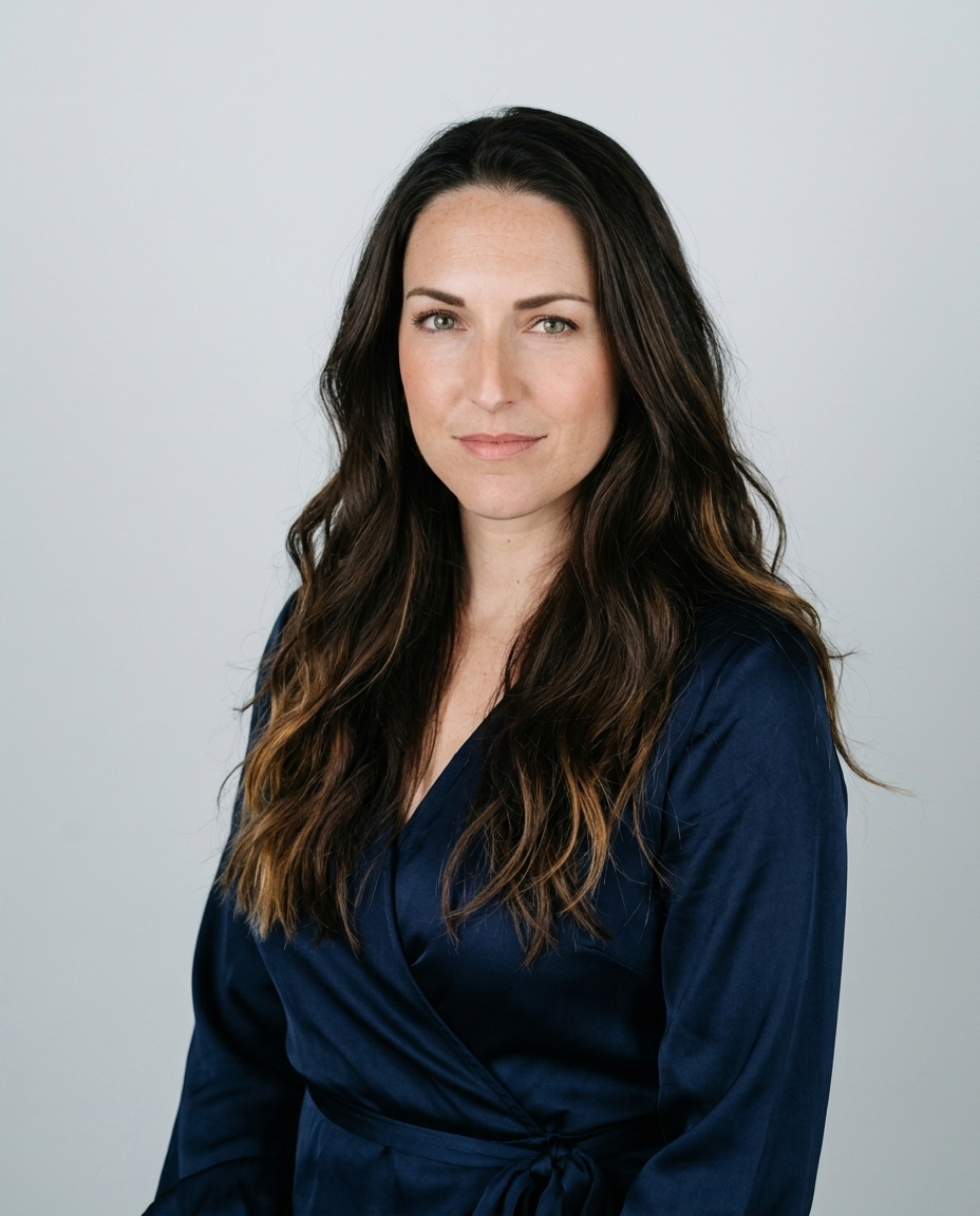

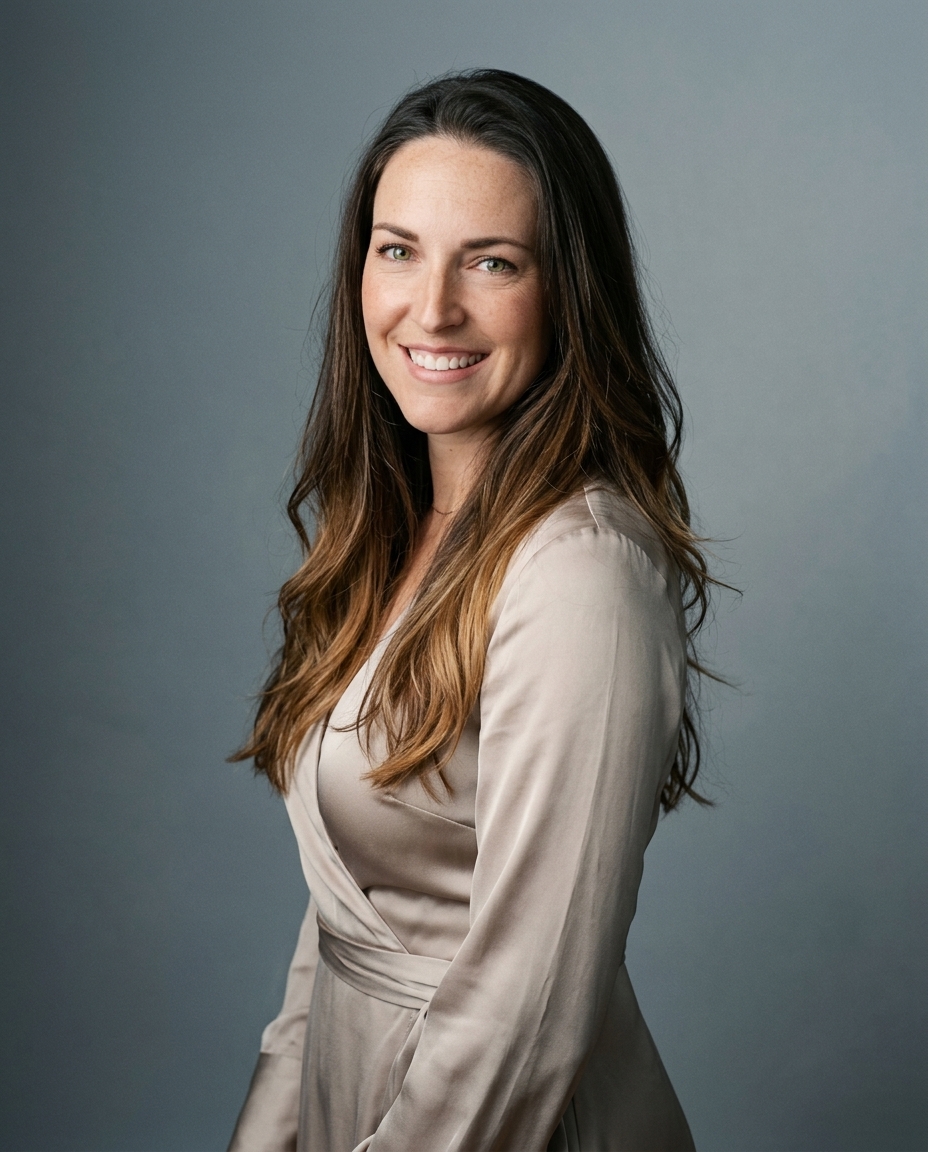

Navy and charcoal are the safest choices for most professional headshots. Burgundy, soft jewel tones, earth tones, black, and white or cream serve more specific brand and industry goals.
The surprising part is that the “best” color often has less to do with fashion than with separation. A headshot works when your face stays prominent against your clothing and background, especially in a small LinkedIn image. Color also affects perceived warmth, authority, approachability, and brand recognition.
Color psychology supports the practical preference for muted clothing. A 2024 Psychology Today summary of experimental findings reported that people shown in or surrounded by high-chroma colors were perceived as more open and extraverted than people in low-chroma settings. That doesn't make vivid color wrong. It means bright color changes the message.
At Studio Pod, we approach AiHeadshots as photographers first. Joseph West and Chris Bailey founded our Houston studio after shooting 10,000+ real professionals since 2019. AiHeadshots delivers 30+ studio-grade headshots in about 30 minutes from 10–20 phone selfies, with no studio visit required. These seven palettes give you a direct starting point.
Table of Contents
- 1. Charcoal gray for corporate authority
- 2. Navy blue for authority with approachability
- 3. Burgundy or deep wine for warmth without casualness
- 4. Blush, mauve, or soft jewel tones for personality
- 5. Black for maximum contrast and editorial polish
- 6. White or cream for minimalist positioning
- 7. Earth tones for authenticity and approachability
- 7-Color Headshot Comparison
- Choose the signal, then test the frame
1. Charcoal gray for corporate authority
Charcoal gray is the strongest default for a traditional professional portrait. It looks authoritative without the severity of pure black, and it maintains visual depth under portrait lighting.
A charcoal jacket gives the face enough separation from the clothing while staying neutral across finance, law, technology, healthcare, and nonprofit work. Light gray backgrounds are especially versatile, but charcoal also works against white, soft gray, deep navy, and controlled studio backdrops. The principle is simple. Your clothing, skin tone, and background must remain distinct.
Photography guidance consistently identifies cool neutrals and deep muted tones as reliable choices. A portrait color guide from Tov Studio recommends navy and charcoal for corporate imagery and identifies deep gray backgrounds and dark textured walls as effective business-portrait settings.
Practical rule: Pair charcoal with a crisp white, light blue, or pale gray shirt. The lighter layer creates a clean frame around your face.
Fabric matters. A subtle herringbone or fine weave adds shape without creating the visual noise caused by stripes, plaids, and busy patterns. Fine stripes can also produce moiré, a distracting shimmer in digital photographs, as explained in this professional headshot clothing guide.
For LinkedIn, legal profiles, medical practices, and corporate team portraits, charcoal gives you the widest margin for error. Read our guide to attire for professional headshots before choosing the shirt and neckline that sit beneath it.

2. Navy blue for authority with approachability
Navy is the best alternative when charcoal feels too formal. It communicates competence and stability, but its blue undertone gives the portrait a more open, client-facing character.
That balance works well for consultants, accountants, attorneys, executives, recruiters, and sales professionals. Navy also aligns with the broader workplace association between blue and trust. The shade should be deep and muted, not electric blue or royal blue. Saturated, high-chroma clothing can pull attention away from the face, while navy keeps the frame controlled.
A business portrait color guide from Metroplex Headshots identifies navy, charcoal, and muted jewel tones as dependable choices because they create facial contrast without overwhelming the frame. That makes navy particularly useful for personal brands that need to look polished without appearing distant.
Wear navy with white, cream, or light gray. Avoid pairing it with a black shirt unless you want a sharper, more severe editorial effect. A navy blazer over a pale shirt gives the portrait tonal variety and keeps the neckline visible.

Navy also pairs well with blurred backgrounds because the clothing remains clear while the background loses competing detail. For teams, combine navy and charcoal rather than forcing everyone into one identical shade. The result feels coordinated while preserving individual distinction.
3. Burgundy or deep wine for warmth without casualness
Burgundy introduces personality without the aggressiveness of bright red. It reads as confident, established, and intentional.
Choose it for leadership portraits, creative directors, entrepreneurs, therapists, healthcare professionals, and marketing specialists who want more visual distinction than navy provides. The color has enough depth to hold facial contrast, especially against light gray, cream, or softly lit neutral backgrounds.
Bright red attracts attention quickly and can dominate a small portrait. Burgundy does the opposite. It keeps the energy of red while reducing visual intensity. That makes it a strong choice for a founder who wants a memorable profile image without looking casual.
A headshot color guide from Megan Murray Photography places burgundy among the muted jewel tones that add personality while preserving a polished appearance. The same guidance favors texture over pattern, which is useful here. A matte blazer, knit jacket, or fine wool texture gives burgundy dimensionality without making the garment the subject.
Choose true burgundy or deep wine. Brownish red often looks muddy, while bright red changes the portrait's energy.
Pair burgundy with cream, white, soft gray, or warm taupe. Keep the background quieter than the clothing. A studio background with controlled lighting will emphasize the richness of the color, while a busy office background can make the frame feel crowded.
For a team, burgundy works best as part of a defined palette. One person in burgundy alongside charcoal and navy can create useful variation. Random bright colors across a group won't create the same visual cohesion.
4. Blush, mauve, or soft jewel tones for personality
Soft jewel tones give a professional headshot a human, distinctive quality. Think dusty rose, mauve, soft teal, muted sage, and restrained blush.
These colors suit coaches, educators, HR leaders, wellness professionals, creative consultants, and founders whose work depends on approachability. They also support personal brands that need warmth without sacrificing credibility. The color should have depth. Pale pastel fabric can sit too close to a light complexion and flatten facial separation, while a muted jewel tone keeps the image structured.
Skin tone changes the recommendation. Capturely's professional headshot clothing guide advises mid-tones and deeper shades for light complexions, while deeper complexions can pair effectively with jewel tones such as teal, amethyst, ruby, and emerald. The goal isn't maximum contrast at any cost. It's clean separation that still looks harmonious.
Use a white, gray, or studio background with mauve and blush. Soft teal works against neutral gray, cream, or a deeper navy backdrop. Avoid a background that shares the same value and saturation as the clothing.
Read our guide to what to wear for a LinkedIn headshot for a broader approach to solid, neutral, and jewel-toned clothing.
Test the color under both natural and artificial light before committing to a team palette. Lighting changes how warm and cool tones appear on screen. A color that looks refined in a fitting room can look washed out or overly saturated under a portrait setup.
5. Black for maximum contrast and editorial polish
Black is direct, contemporary, and visually strong. It works particularly well for founders, designers, artists, creative directors, musicians, podcast hosts, and executives who want an editorial profile image.
Traditional corporate portraits often favor charcoal or navy because they feel less severe. Black creates a sharper message. It can signal authority and sophistication, but it can also feel distant in relationship-driven professions. A therapist, educator, or community leader should choose black only when it fits the rest of the brand.
Lighting determines whether black looks polished or flat. Pure black can absorb detail, especially against a dark background. Technical headshot guidance from Pete Copeland warns that pure black can create a flat or floating-head effect, while mid-tone saturated colors preserve more shape under studio lighting.
Wear black with a white, cream, or light gray shirt. Avoid an all-black outfit against a dark background unless the lighting is designed to separate your shoulders and hair from the set. A blurred or studio background usually gives black enough room to read clearly.
The classic example is Steve Jobs' black turtleneck. It became part of his personal brand because the clothing was simple, consistent, and visually unmistakable. That approach works only when the choice feels deliberate. If black doesn't match your communication style, navy will give you authority with more openness.
6. White or cream for minimalist positioning
White and cream create a clean, modern portrait. They suit technology leaders, contemporary executives, coaches, consultants, and personal brands built around simplicity.
Light clothing creates reverse contrast, especially against deeper skin tones or a darker background. That can make the portrait feel bright and editorial. Against light skin and a white background, however, white clothing can merge into the frame. Headshot background guidance from HeadshotPhoto.io emphasizes separation between skin, clothing, and backdrop as the central color decision.
Pure white also demands careful lighting. Studio lights can blow out bright fabric and reduce detail. Cream, ivory, and warm white often provide a gentler alternative because they retain tonal variation. Use structured cotton, a linen weave, or another fabric with visible depth. Flat white fabric can look austere.
Pair white or cream with a rich neutral underneath, or use a darker background to establish clear boundaries around the shoulders. White on white can work with controlled lighting and careful exposure, but it gives you less margin for error.
This palette fits a modern brand more than a conventional corporate standard. It can look excellent on an executive website, speaker profile, or personal-brand page. It is less practical if you need one image to feel equally traditional across law, finance, healthcare, and government audiences.
7. Earth tones for authenticity and approachability
Earth tones bring warmth without looking trendy. Caramel, rust, terracotta, warm tan, olive, and rich brown support a grounded, human-centered professional image.
Choose these colors for therapists, educators, coaches, wellness practitioners, nonprofit leaders, sustainability professionals, and social-impact founders. They feel less corporate than charcoal and less formal than black, but they still look intentional when the shade has enough saturation.
Skin tone and background need careful attention. Warm browns and tan clothing can disappear against similar complexions or beige backdrops. Lifehacked AI's headshot color guidance recommends maximizing contrast and notes that neutral mid-gray backgrounds allow colors such as teal, blue, burgundy, and emerald to separate cleanly, while muted taupes and grays can blend into gray walls.
Use earth tones with a neutral background, not a matching beige environment.
Pair rust or terracotta with white, cream, or a complementary warm neutral. Avoid black if you want the image to feel approachable, because the contrast can become unnecessarily harsh. A warm studio background can support the palette, but it should remain darker or lighter than the clothing.
Earth tones are also useful for teams that want to look unified without appearing overly formal. A shared family of rust, olive, caramel, and warm brown creates a natural visual language. Keep the garments solid and coordinate the values rather than requiring identical outfits.
Read our guide to professional headshots outside if you want to carry this grounded palette into an outdoor personal-brand setting.
7-Color Headshot Comparison
| Option | Process / Complexity 🔄 | Resource / Efficiency ⚡ | Results / Impact 📊 | Ideal use cases 💡 | Key advantages ⭐ |
|---|---|---|---|---|---|
| Charcoal gray, the corporate standard | Low, straightforward, neutral styling | High efficiency, minimal lighting/retouching needs | High contrast & dimensional; scales well from 150×150 to print | Corporate LinkedIn, exec portraits, team galleries | ⭐⭐⭐⭐⭐ Universally appropriate; reliable across industries |
| Navy blue, authority with approachability | Low–Medium, manage blue casts carefully | Efficient, stable across devices and formats | Approachable authority; harmonizes with LinkedIn interface | C-suite, client-facing roles, consulting, management | ⭐⭐⭐⭐ Conveys leadership with warmth |
| Burgundy / deep wine, warmth without casualness | Medium, needs confident styling and correct lighting | Moderate, careful color rendering to avoid muddiness | Warm, sophisticated differentiation; trending for mid–senior leaders | Entrepreneurs, creatives, senior leaders, marketing | ⭐⭐⭐⭐ Differentiates while retaining credibility |
| Blush / mauve / soft jewel tones, personality within professionalism | Medium, must select true jewel tones (not pastels) | Moderate, sensitive to lighting and skin-tone rendering | Signals approachability and personality; memorable in people-centered roles | Coaches, HR, wellness, creative consultants, solopreneurs | ⭐⭐⭐⭐ Expressive yet professional when executed well |
| Black, maximum contrast and editorial polish | Medium, requires photographer-quality lighting to avoid flatness | Moderate, high contrast demands careful retouching | Bold, editorial polish; strong differentiation for founders/creatives | Founders, designers, creatives, thought leaders | ⭐⭐⭐⭐ Commands attention; high-impact when intentional |
| White / cream, minimalist and modern | High, demanding lighting and retouching to prevent washout | Lower efficiency, needs precise setup and post-processing | Minimalist, modern look; distinct but higher risk of washout | Female executives, founders, modern personal brands | ⭐⭐⭐ Distinctive modern positioning; high risk/reward |
| Earth tones, authenticity and approachability | Low–Medium, pick saturated, intentional shades | Efficient, photographs warmly with proper tones | Authentic, grounded impact; strong for values-driven leaders | Therapists, coaches, educators, nonprofit, sustainability | ⭐⭐⭐⭐ Conveys warmth and approachability, great for teams |
Choose the signal, then test the frame
Use charcoal or navy when you need broad professional flexibility. Choose burgundy or soft jewel tones when warmth and personality matter. Select black or white and cream for editorial differentiation. Use earth tones for approachable, values-driven positioning.
Then test the complete frame, not just the garment. Check the relationship between your skin undertone, neckline, fabric texture, clothing value, and background. A color that looks excellent in isolation can fail when it sits too close to your complexion or disappears into the backdrop.
Light gray remains one of the most adaptable background choices because it supports separation across many wardrobes. Deep navy, charcoal, teal, and olive backgrounds can also flatter skin by creating controlled contrast, provided the clothing doesn't share the same value. Portrait color guidance from Tov Studio explains why backgrounds near or opposite common skin hues can help the subject stand out without competing with facial features.
Avoid busy patterns, fine stripes, large logos, and graphics. Solid colors keep attention on your face and reduce digital artifacts. Pure white needs controlled exposure, while pure black needs enough edge light and background separation to preserve shape.
AiHeadshots gives you a practical way to test more than one direction. Upload 10–20 phone selfies, skip the studio visit, and receive 30+ studio-grade headshots in about 30 minutes. Plans start at $29, and the service includes a 100% money-back guarantee within 14 days. Studio Pod built AiHeadshots from photographer experience, not by retrofitting open models. Our founders, Joseph West and Chris Bailey, have photographed 10,000+ real professionals in Houston since 2019. You can review the available options on the AiHeadshots pricing page.
For broader product context, see the AiHeadshots examples, customer reviews, and information about corporate team headshots. For an unrelated hair-fiber reference, see this PRP hair-loss fiber guide.
Upload 10 selfies, see your first headshot in 30 minutes for $29.
Upload 10–20 phone selfies to AiHeadshots and test charcoal, navy, jewel tones, or earth tones against studio-designed backgrounds. Visit AiHeadshots to receive 30+ studio-grade headshots in about 30 minutes, with plans starting at $29 and no studio visit required.