



The background is read before the face. A viewer registers the decade, the formality, and the mood of a backdrop, then starts reading your expression. Get that order wrong and an otherwise good portrait feels off: the person is fine, the wall behind them is arguing.
Running a portrait studio teaches you how light lands on a face, why a jaw looks wrong at 35mm, and what separates a LinkedIn-ready shot from a snapshot. It also teaches you the cost side. A photographer's day rate is a real line item, and a reshoot costs it all over again. The backdrop is the one variable you can change without booking another session, another stylist, or another afternoon.
It is also the most frequently misjudged variable. A Kantar survey of 6,512 adults across 13 major markets found that 48% associated nostalgia with a happy memory and another 48% with childhood, while only 19% associated it with a retro or vintage look. The styling is the smallest part of what a viewer responds to. The feeling the styling triggers is the whole thing.
Retro backdrops live or die in that gap. Each of the eight looks below fits a specific role, sends a specific signal, and breaks in a specific way. I've ranked them by what a viewer reads from the face against each one.
Table of Contents
- 1. Mid-century modern gradient backdrop
- 2. 1980s synthwave neon grid
- 3. Memphis Group pattern
- 4. Art Deco geometric frame
- 5. Warm 1970s sunset stripes
- 6. Vintage Kodachrome film look
- 7. Polaroid instant-film frame
- 8. Risograph halftone dot pattern
- Retro background styles compared by role, tone, and main risk
- Choose one look for your role and test it on your own photos
1. Mid-century modern gradient backdrop
Mid-century modern is generally dated from the late 1930s through roughly 1970, and it developed alongside the New Bauhaus school in Chicago in the early 1940s and the later Swiss International Typographic Style, as Creative Bloq's guide to mid-century modern graphic design sets out. The period never settled on one palette. Designers worked in bright primaries and secondaries, in earthy olive, paprika, and gold, and in pairings such as mint green, fuchsia, and turquoise.
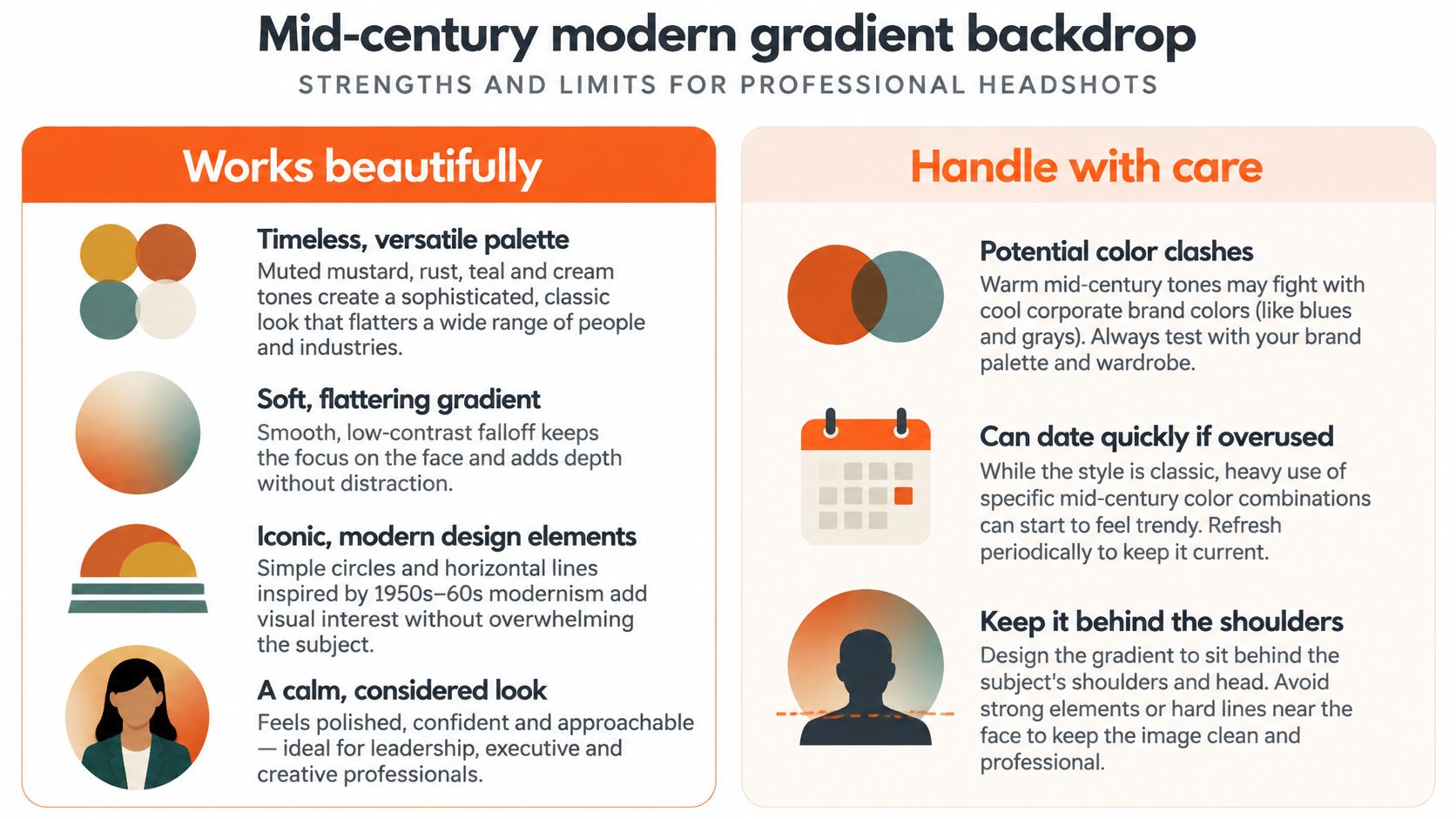
That range is the difference between a period-accurate backdrop and a sepia filter. A gradient built from mustard into cream and teal is a design choice. A brown wash is just age.
On a face, a soft gradient does one valuable thing: it keeps the highest local contrast in the frame on the eyes and the mouth. Nothing behind the subject competes for the eye's first stop. That's why it holds up for architecture partners, design studio leadership, and creative directors who need to look considered rather than styled.
Three things make it work on a real set:
- Anchor one hue to the brand. Pull a single color from the company's accent palette and let the gradient resolve into it, so the portrait sits inside the brand instead of next to it.
- Keep the transition behind the shoulders. The brightest point of the gradient belongs at shoulder height or lower, never directly behind the crown of the head.
- Warm for creative roles, neutral for finance and legal. A paprika-heavy version reads expressive. A cream-and-stone version reads steady.
The failure mode is the hairline. Slide the bright patch of the gradient directly behind the head and fine hair dissolves into it, which makes the subject look badly cut out. Say a twelve-person studio needs a consistent team page: one gradient, shifted two stops cooler for the two people with light hair, solves it without breaking the set.
If you're weighing this against flatter options, these best backgrounds for LinkedIn cover the neutral end of the range that most corporate briefs still default to.
2. 1980s synthwave neon grid
A dark field, a magenta and cyan horizon, a perspective grid, and a sunset disc. The vocabulary comes from 1980s arcade graphics, got revived by the synthwave music scene, and landed in mainstream visual culture through the 2011 film Drive, directed by Nicolas Winding Refn.
The look makes a claim about identity, not competence. That's a fine claim for a musician, a streamer, a game developer, or a founder whose personal brand is the product. It's a bad claim for anyone whose client is deciding whether to trust them with a mortgage.
The treatment has never been more available. Freepik's 2025 visual trends report recorded a 61% increase in global searches for "retro style" and a 24.5% increase for grunge texture, based on 2024 versus 2023 data. Volume of use is exactly the risk: a style everyone can generate stops signaling individuality and starts signaling a template.
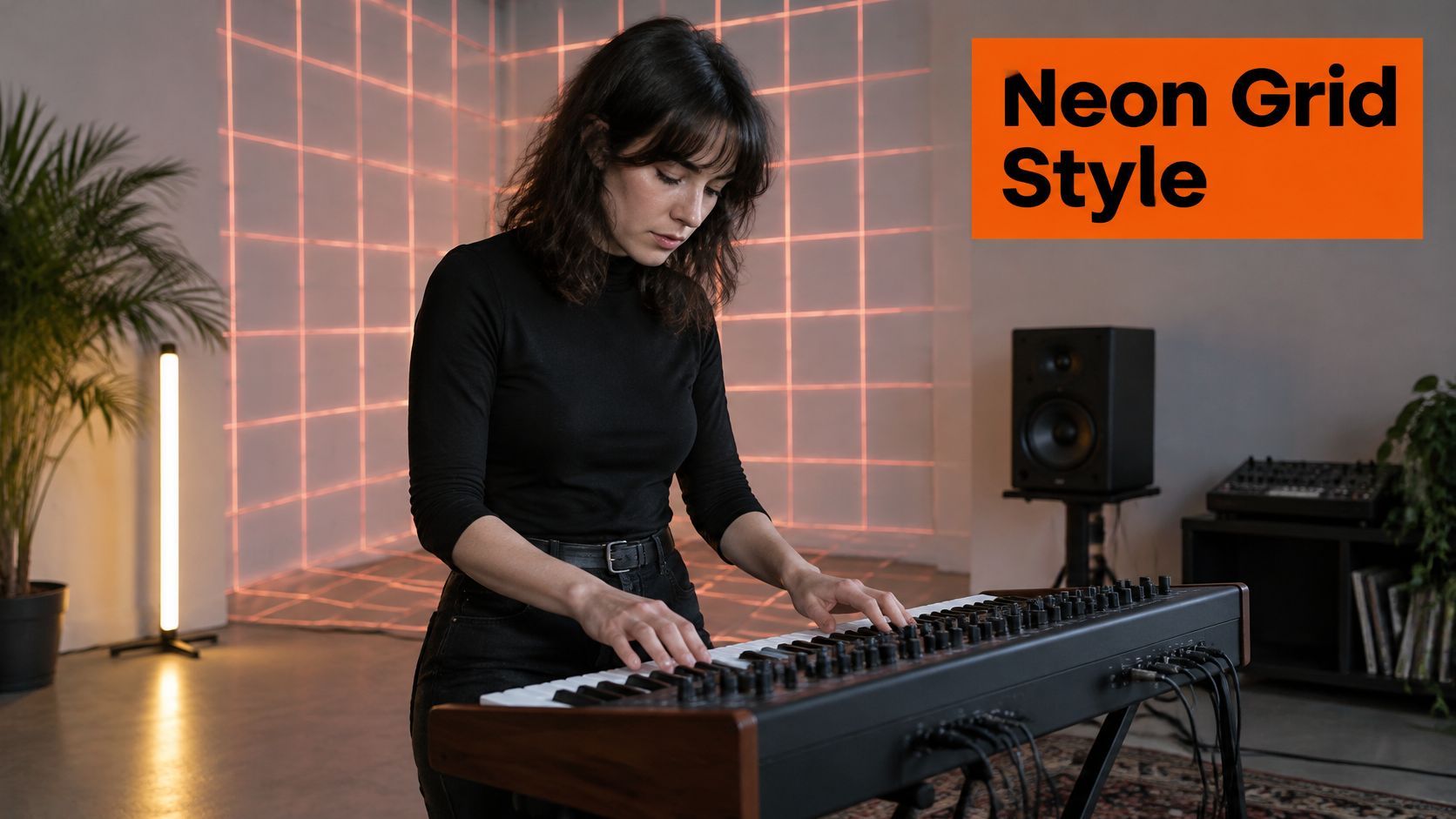
Where it fails is the face. A saturated magenta or cyan horizon competing with skin tone pulls color into the cheeks and under the eyes, and the correction you make in post flattens the whole image. Push the grid far enough back that it reads as atmosphere rather than scenery, and use a single neon color as a rim light on the shoulder so the subject and the background share one light source.
The line I hold: if a stranger's first comment is about the background, the background won the argument and the portrait lost it.
Here's the same treatment on a moving subject, which shows how much the grid has to sit back to keep a face readable in motion:
Use this one for individual personal-brand portraits. Applying it across a team of fifteen produces a roster that looks like a game studio's About page, which is fine if you are a game studio.
3. Memphis Group pattern
The Memphis Group formed in Milan in 1981 around Ettore Sottsass and a circle of designers who rejected the minimalism of the moment. They produced furniture, textiles, and ceramics built from clashing primaries, terrazzo-like speckles, squiggles, and shapes that refused to line up. The style is loud on purpose.
Its comeback is measurable. In 2025, more than 80% of 643 professional designers surveyed by 1stDibs said they planned to use furniture or objects from the 1920s through the 1990s in their projects, according to 1stDibs' designer trends coverage in Elle Decor. Designers have gone retro wholesale, and Memphis sits squarely inside that sweep.
As a headshot backdrop it does one thing better than any other look on this list: it signals an eye for design. A graphic designer, an illustrator, or a brand strategist working with creative agencies can carry it. A fractional CFO can't.
The failure is spatial, not stylistic. Pattern creates edges everywhere, and a face needs the frame's sharpest edge. When the squiggles are as crisp as the eyes, the viewer's attention splits between the person and the wallpaper. Blur the pattern one step, drop it to three colors maximum, and it goes back to being a mood.
There's also a scale problem. Squiggles that read as playful at 800 pixels wide become visual dirt at 60 pixels in a comment thread. Test the pattern as a thumbnail before you commit it to a full team set, and if the shapes smear, replace them with a flat color drawn from the same palette.
Trade-off: Memphis buys personality and spends credibility. Decide which one your role can afford.
4. Art Deco geometric frame
Symmetrical fans, stepped lines, sunburst rays, metallic gold or black accents. Art Deco arrived in the 1920s and 1930s and left physical proof: the Chrysler Building in New York, completed in 1930, and the South Beach Art Deco District in Miami Beach.
The retro distinction matters here. Vintage means an object produced in the past. Retro means something newly made and deliberately styled after an earlier era, which is how a 2024 study of the current role of retro marketing frames it. That same study surveyed 415 consumers aged 18 to 75 and found that 80% trusted brands that had been present for a long time. Retro styling borrows that credibility by association, which is precisely why it belongs in conservative industries.
For law, private wealth, and executive portraits, Art Deco gives a formal, slightly theatrical frame that reads as institution rather than personality. A partner at a firm founded in 1972 can stand in front of a 1930 motif without anyone claiming it's dishonest.
The failure is the sunburst. Rays radiating from behind the head turn a portrait into a religious painting, and gold accents placed near a warm skin tone pull yellow into the face. Keep the motif low, out of focus, and small. Dark matte tones with one restrained metallic accent will outperform a full gold frame every time.

Center the subject on the central motif and the composition balances itself. Shift them half a step off axis and the symmetry stops being an asset and starts looking like a mistake.
5. Warm 1970s sunset stripes
Layered horizontal bands moving from orange through mustard and burgundy into brown. The lineage is 1970s print advertising, album covers, and consumer packaging, and the palette isn't random. Bright hues dominated the 1950s while earthier colors took over in the 1960s, as 99designs' history of mid-century modern design describes, with mustard yellow, teal, burnt orange, olive, mint, turquoise, gold, paprika, and pumpkin recurring across the period.
That's the most useful thing about this look: the color choice sets the decade. Saturated primaries read postwar. Mustard, olive, paprika, and warm neutrals read later and softer.
The result is friendly and approachable, which is why it works for small business owners, coaches, therapists, and anyone whose job is to make a nervous person feel comfortable in the first thirty seconds. It's the wrong choice for a bankruptcy attorney.
Where this style breaks is contrast, and the break is measurable. WCAG 2.2 requires at least 4.5:1 for normal text, 3:1 for large text, and 7:1 for AAA, and testing on retro palettes shows dark brown against aged cream reaching 11.18:1 while faded amber against cream manages only 1.60:1 and fails, per Paletteforge's retro palette contrast testing. The moment your portrait becomes a nameplate, a team directory card, or a thumbnail with text on it, that math applies to you.
Keep the bands behind the shoulders, never crossing the jaw, and dress the subject in cool or neutral tones so the body separates from the background. If you're building a set, these headshot background images show how the same warm bands behave behind different wardrobes.
6. Vintage Kodachrome film look
Warm, faintly grainy, faded color, lifted blacks, a soft vignette. Kodak introduced Kodachrome in 1935 and discontinued it in 2009, with the final rolls processed in 2010. The look carries eighty years of documentary association with it, which is exactly the point.
This is the retro backdrop for people who don't want to look like they tried. Nonprofit directors, community organizers, consultants, and coaches whose entire offer is honesty benefit from a background that says this person was photographed, not produced.
The commercial case is stronger than it sounds. Kantar's nostalgia research reports that 68% of consumers were more likely to purchase a product connected to childhood or younger years, and 60% were willing to pay more for products that evoked positive memories. Memory does the selling. The grain is just the delivery mechanism.
Two technical rules keep it from becoming a costume:
- Keep the grain off the eyes. Grain belongs in the background and the shadows. Applied evenly across the face, it reads as noise and softens the one feature that has to stay sharp.
- Light it like daylight. Hard studio lighting plus a faded film look argues with itself. Window-quality light and a lifted black point belong together.
Skip the heavy vignette. A dark falloff that swallows the hair and shoulder line makes the subject look pasted onto the backdrop instead of standing in front of it. For a broader look at how far this treatment can go before it turns kitschy, the vintage Polaroid photo look is the useful next comparison.
7. Polaroid instant-film frame
Edwin Land introduced Polaroid instant photography in 1948, and the SX-70 system followed in 1972. The frame is the recognizable part: a white border around a soft, slightly faded square with a heavier margin at the bottom.
The trust signal here is informality. A Polaroid border tells the viewer this portrait was caught in the moment rather than staged, so it suits photographers, artists, and creative freelancers whose social profiles benefit from a little looseness. On a corporate page or a client-facing directory, the same frame reads as a photo of a photo, and that extra layer of remove costs you directness.
The failure is scale, and it is the one people miss. The white border shrinks the working area of the frame before the viewer has registered a single feature, so the face has to carry the image in less space. Most professional-photo guidance still recommends solid gray, white, or muted blue backgrounds for profile images, as Snappr's review of LinkedIn profile photos shows, and the reason is practical: a clean field keeps the face identifiable at small sizes. At 60 pixels, a thick white margin is the difference between a face and a smudge.
Test it before you commit. View the image at avatar size, then in grayscale, then through a color-vision simulation. If the face still reads as a face in all three, the frame is doing its job. If the border is the most legible thing in the image, crop tighter so the subject fills the frame and the border reads as a deliberate margin rather than packaging.
Where it belongs: personal sites, Instagram, portfolios, and anywhere a human is browsing. Not a client-facing directory.
8. Risograph halftone dot pattern
A two- or three-color field built from visible halftone dots, slightly misregistered color layers, and uneven ink coverage. Risograph printing was developed by Riso Kagaku Corporation in Japan in the 1980s and became the house style of zines and independent publishers. It reads as crafted and modern at once, which is a rare combination.
The dots aren't decoration. Halftone has a specific technical origin: William Henry Fox Talbot proposed using a screen or mesh to break continuous photographic tone into printable dots, and early screening placed a coarse woven fabric in front of the camera plate so light formed a pattern through interruption and diffraction, as the history of halftone printing documents. In newspaper production, halftone replaced hand-carved woodcut approaches that had made photographic subjects look like sketches. A visible-dot background references a real reproduction process.
That credibility makes it a strong choice for editorial portraits, independent publications, and marketing teams at creative agencies that want a distinct voice without going neon.
The failure is dot size against skin. Dots large enough to see clearly at full size will fight skin texture and pores, and the face starts to look printed rather than photographed. Keep the dots small, keep the palette to two colors that match the brand, and check the result after mobile compression, where fine dot patterns produce moiré that no amount of retouching removes.
Run it on one subject before you roll it across a team. A pattern that flatters one complexion and hair color can muddy another, and a set is only as consistent as its worst frame.
Retro background styles compared by role, tone, and main risk
| Item | Best for | Tone | Main risk |
|---|---|---|---|
| Mid-century modern gradient backdrop | Creative leaders and corporate professionals | Calm and considered | Warm hues may clash with cool brand colors or feel overused |
| 1980s synthwave neon grid | Musicians, gamers, and creative personal brands | Bold and high-energy | Too striking for conservative fields; neon spill can affect skin tones |
| Memphis Group pattern | Designers, illustrators, and creative brands | Playful and confident | Busy shapes can compete with the face |
| Art Deco geometric frame | Law, finance, and executive portraits | Formal and polished | Ornamentation can distract or feel dated |
| Warm 1970s sunset stripes | Small businesses, coaches, and hospitality brands | Warm and approachable | Strong colors may clash with clothing or feel unsuited to finance and tech |
| Vintage Kodachrome film look | Nonprofits, consultants, and documentary-style portraits | Human and authentic | Heavy grain can look dated and reduce crispness |
| Polaroid instant-film frame | Artists, photographers, and social profiles | Personal and friendly | The border reduces image space and is less formal |
| Risograph halftone dot pattern | Independent publications and creative agencies | Modern and editorial | Texture can compete with facial detail and may not suit every industry |
Choose one look for your role and test it on your own photos
Eight looks, eight different reads. The mid-century gradient says considered. Synthwave says independent. Memphis says creative. Art Deco says institution. Sunset stripes say approachable. Kodachrome says honest. Polaroid says personal. Risograph says editorial.
None of them say all of those things, and that's the point. Match one look to the job your photo has to do, then prove it on a single frame before it touches anyone else's.
Run that test properly. Look at the image at 60 pixels wide. Convert it to grayscale and check whether your face still separates from the background. Squint at it and see which element holds your eye first. If the answer isn't your face, the backdrop is doing too much and needs to come down a stop, blur a step, or lose a color.
For a team, the reverse applies. Lock the backdrop, the outfit, and the style once, and every person in the set matches, because a team page is read as a grid before it's read as individuals. One person with a neon grid among fourteen neutral portraits doesn't look like an individualist. They look like a mistake in the export.
That's why we let an admin set the styles once for a whole team, with the same crop and the same background across every seat. Remote hires upload their own phone photos into the same color calibration the studio uses, and the grid stays consistent.
The practical step is the cheap one. Basic is $29 for 30 headshots in 3 style looks, and every plan includes an outfit change and up to 4 backgrounds, so you can put the same face against four different retro treatments and see which one survives the thumbnail test. Compare tiers on the pricing page before you commit a whole team.
Upload 10 selfies, see your first headshot in 30 minutes, for $29.
AiHeadshots is the headshot product built by the photographers at Studio Pod, and the retro backdrop is one of the variables we tune per person rather than a filter slapped on at the end. You upload 10 to 20 phone selfies, pick a style, and get 30 finished portraits back in about 30 minutes, with outfit and background options you can compare side by side. Start at AiHeadshots and test a mid-century gradient against an Art Deco frame on your own face before you decide.