



A professional headshot doesn't need a blank white background. LinkedIn's profile-photo guidance explicitly allows a simple outdoor setting or painted wall, provided the surroundings don't compete with the person. The useful distinction isn't studio versus location. It's a background that frames your face versus one that distracts from it.
Choose headshot background images for the job the portrait needs to do. Then check the lighting, the treatment of hair and clothing, and the crop where the image will appear. An attractive backdrop isn't enough if the finished portrait loses your outline or introduces the wrong context.
Table of Contents
- Which headshot background fits your goal
- How background color and context shape hiring judgments
- Lighting the background so the subject stands out
- Standardizing team backgrounds without erasing people
- Sizing and file specs for background images
- Confirm the background before you upload
Which headshot background fits your goal
Solid light gray or soft blue suits most professional headshots because it keeps attention on the face without demanding a particular setting. Start there unless your role, brand, or publishing requirements give you a concrete reason to choose something else.
A background should answer a useful question. Does this person belong in a coordinated company directory? Does the portrait need to suggest a working environment? Is it intended for a speaker announcement rather than a broadly screened application? Those are different assignments.
Background choice by goal
| Goal | Background | Why it works |
|---|---|---|
| LinkedIn and job search | Solid light gray | Keeps attention on the face with little competition for the eye |
| Corporate team pages | Soft blue or off-white | Matches restrained brand palettes and supports consistency across staff |
| Legal, medical and finance | Neutral gray or softly blurred office | Signals settled credibility without relying on props |
| Client-facing consultants and realtors | Lightly blurred office or outdoor scene | Shows context while keeping the face clear |
| Speakers and creative professionals | Textured or mid-tone brand color | Adds personality within a controlled color family |
| Executive portraits | Dark low-key backdrop | Produces a dramatic look that needs controlled light spill |
| Bold roles that need dominance | Saturated red | Reserves an assertive visual treatment for brands that deliberately want it |
The trade-off with environmental backgrounds is specificity. An office suggests professional context, but visible signage, furniture, and architectural details also introduce information that the viewer doesn't need. Blur should simplify those details, not turn a recognizable distraction into a soft distraction.
Texture needs similar restraint. Fine plaster or a gentle tonal variation gives a creative portrait depth. Strong brickwork, pronounced folds, and high-contrast patterns become separate subjects.
Selection rule: Choose the least elaborate background that communicates the right context.
Wardrobe belongs in the decision too. A pale jacket against off-white loses its outline without careful lighting. A dark suit against charcoal needs deliberate separation. Don't choose the backdrop independently and expect editing to resolve every conflict afterward.
Finish by viewing the portrait at thumbnail size. Your face should be the first thing you see, not the wall, scenery, or brand color.
How background color and context shape hiring judgments
In a 2021 survey of more than 200 human-resources professionals, business owners, and managers, 80% considered a candidate's LinkedIn profile picture an important ranking factor, while 71% admitted rejecting a qualified candidate because of a poor profile picture, according to PCMA's account of the survey. Those findings concern the whole profile picture, not background color alone. They don't establish that a particular backdrop causes a hiring outcome.
They do establish a practical stake: people evaluate presentation alongside qualifications. Other people, clutter, harsh contrast, and an obviously casual setting introduce distractions before a viewer reads your experience. Remove those distractions rather than trying to communicate an entire career through scenery.
Color changes the framing
A controlled 2024 study published in Evolutionary Psychology found that ambiguous faces presented against red backgrounds were more likely to be judged as dominant than the same faces against gray or green. That's a finding about perception under controlled conditions, not evidence that red improves professional credibility.
For practical palette selection, use neutral gray, off-white, or restrained blue when the portrait must work across broad professional audiences. Reserve saturated red for a deliberate brand position. Assertiveness isn't interchangeable with trust, warmth, or competence.
A neutral backdrop also limits irrelevant context. A luxurious interior, religious object, or visible lifestyle detail gives viewers material for assumptions unrelated to your work. Don't use an elaborate setting as a substitute for a clear, recognizable portrait.
A background frames the person. It doesn't prove competence.
Keep the distinction between presentation and fairness explicit. Candidates aren't less qualified because their pictures are less polished, and employers shouldn't treat a photographic style as evidence of capability.
Before publishing, compare candidate backgrounds in the actual interface. A saturated field that looks balanced in a large preview can dominate a small profile image. If the color registers before the expression, reduce its saturation or replace it with a quieter tone.
Lighting the background so the subject stands out
Treat the background as a separately controlled part of the lighting setup, not whatever happens to sit behind the subject. Its brightness determines how clearly you can read the outline of hair, shoulders, and clothing.
Canon's high-key and low-key portrait guide explains the underlying distinction: bright backgrounds require dedicated illumination, while dark backgrounds depend on controlling spill and distance. Weak separation lets dark hair and clothing merge into the backdrop. Excessive background light produces washed edges, halos, and reduced facial contrast.
Use this setup order:
- Create distance. Move the subject away from the backdrop until cast shadows and reflected spill are manageable.
- Meter the background separately. Check its exposure without assuming the face light will produce the intended tone.
- Set the target background. Adjust its light, flags, or distance to achieve the chosen brightness.
- Finalize the subject light. Use a diffused key with controlled fill, then add a modest separation light only where the outline needs it.
Background tone and the lighting it needs
| Background style | Lighting approach | Failure to avoid | Result |
|---|---|---|---|
| Light gray or white, high-key treatment | Light the background above the subject key when the target is near-white | Losing hair and shoulder definition through weak separation or excessive spill | Clean, bright presentation |
| Mid-tone blue or gray | Meter separately and keep the subject away from the backdrop | A bright halo along the edges | Balanced treatment with flexibility for teams |
| Dark, low-key treatment | Use distance, flags, and careful spill control | Muddy hair detail and an underexposed face | Dramatic executive portrait |
| Textured or blurred office | Use shallow depth of field with a diffused key | Distinct objects pulling attention away | Context without visual clutter |
Light gray doesn't need to become white. If you want a visible gray tone, preserve it rather than overlighting the backdrop until it clips.
For a standardized corporate set, a neutral mid-tone background with soft facial lighting and restrained edge separation is the safest default. It gives you more control than an aggressively white or theatrical dark setup.
Standardizing team backgrounds without erasing people
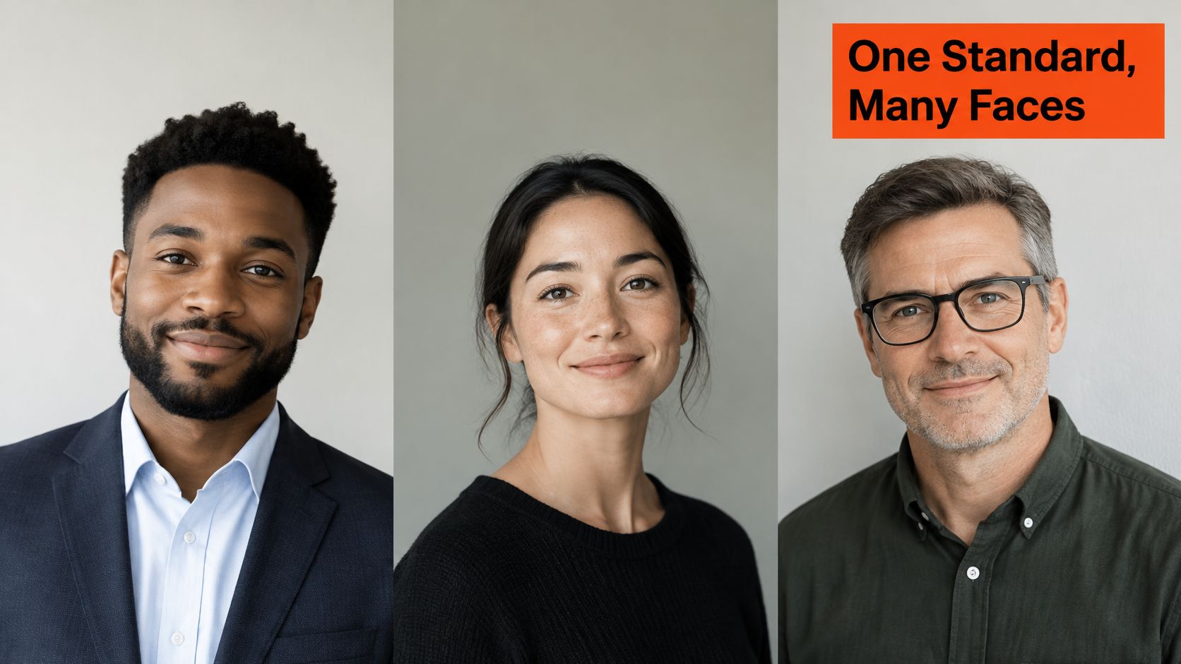
A team page needs one visual standard, not identical pixels. Set a shared background family, crop, and output specification, then check how each choice frames the people represented. A consistent set can support a company website and marketing assets without forcing every subject into the same visual treatment.
The Studio2U employee headshot policy guide connects consistent presentation with alt text, subject-background contrast, and representation of the actual workforce. Use those principles to guide the standard rather than applying a brand color that weakens contrast for some team members.
Review the full set together, then inspect every portrait individually.
Test detail, not just color matching
Check each proposed background against the range of skin tones represented on the team. Inspect facial contours, dark and light hair, glasses, and clothing edges. No single shade guarantees equal separation for every person, so judge the result portrait by portrait.
Use a flat tone if a gradient weakens the outline around hair or shoulders. Gradients can work, but changes in tone may make masking errors and uneven contrast harder to notice. Inspect the full-size file and the final directory crop.
Preserve head coverings, natural hair, cultural dress, mobility aids, and visible disabilities. Choose framing that accommodates the person instead of cropping out meaningful details to meet a rigid template.
Approval standard: Adjust the treatment to preserve the person, not the person to fit the treatment.
Define the publishing specification
Choose a consistent crop, such as shoulders-up or waist-up, and keep head size and eye position comparable. Set a controlled range of luminance and saturation so a brighter or more dramatic backdrop does not suggest a different level of seniority.
Specify a shared output resolution, file format, and file-size target for the destination. Assign someone to write and review alt text wherever the platform supports it. Describe the person and relevant visible context, not promotional language.
A documented photo batch-editing workflow helps apply the standard while retaining individual quality checks.
AiHeadshots team processing takes about 30 minutes per person. Use the team headshot workflow to plan a coordinated set, and make approval depend on readable detail, faithful representation, and consistent presentation.
Sizing and file specs for background images
The headshot backdrop is inside the portrait, behind the person. The LinkedIn profile background is a separate, wide banner behind the profile introduction area. Don't export them as though they were the same asset.
Use this visual distinction when preparing your files.
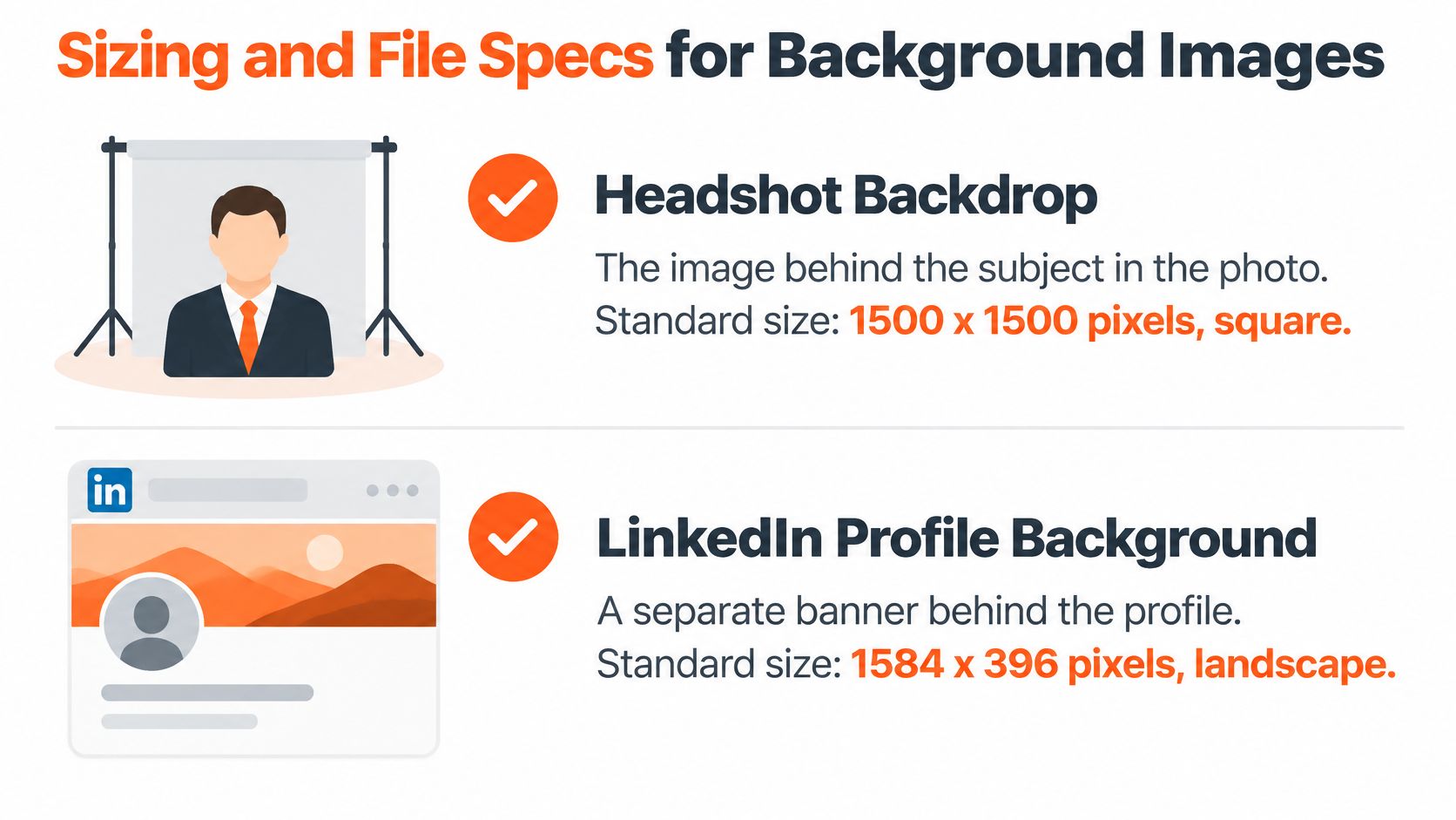
For a personal background banner, LinkedIn specifies 1,584 × 396 pixels, a 4:1 canvas, supports PNG and JPG, and sets an 8 MB maximum for personal profile and background photos. Export at that recommended banner size, save as PNG or JPG, and compress below the upload limit. Keep important content away from the edges, leave room for interface overlap, and preview the result at phone width before publishing.
Export for the destination
A square portrait export is a working format, not a universal headshot standard. Follow the destination's requirements and preserve enough space around the head for its crop. The LinkedIn headshot dimensions guide addresses the portrait separately from the banner.
Add descriptive alt text where the platform provides an appropriate field. Compression should reduce file weight without introducing obvious banding in smooth backgrounds or rough edges around hair.
Use the video walkthrough as an additional visual reference.
A background is ready to publish when the intended crop survives a phone-sized preview and the subject remains clearly readable.
Confirm the background before you upload
Confirm the background against the portrait's purpose before you upload. An understated professional treatment fits broad use. Deliberate environmental context belongs only when the setting adds something relevant.
Inspect the edges next. Curls, glasses, ears, collars, and shoulders are where a replacement background exposes a masking mistake. If you are replacing an existing backdrop, the background remover belongs before the final edge inspection, not after it.
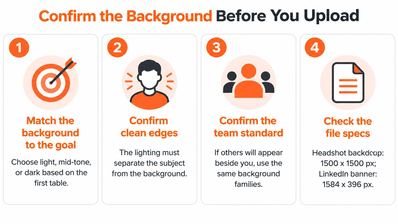
Approve the finished portrait in this order.
Look at the actual directory layout if colleagues will appear beside you. Do not sign off on isolated portraits viewed on different screens.
Open the exported file and place it as a draft where the platform allows it. Check that crop before you commit. An attractive download will not always display unchanged.
Upload clear source photos that show your actual features. Keep expression and appearance consistent enough for a faithful result. I recommend rejecting any finished image that changes your identity or drops details that belong in the portrait. A polished background helps only when the person in front of it still looks like you.
AiHeadshots is built by the photographers behind Studio Pod. Our judgement is that convincing headshot background images start with light, proportion, and recognizable identity, not decorative complexity.
AiHeadshots produces 30 or more print-ready, platform-sized headshots in about 30 minutes from the photos you upload, with no studio visit. A free watermarked preview is available before you pay, and no credit card is required. Each pack is a one-time charge with no subscription. Choose the backdrop, upload your photos, and review pack pricing before you order.